
 Sign in to Mod The Sims
- Site Map >
- Community >
- Non-Sims Discussion >
- Social Groups >
- Mentoring4Builders >
- TS3 Country-ish Cottage Possible Submission :)
- Site Map >
- Community >
- Non-Sims Discussion >
- Social Groups >
- Mentoring4Builders >
- TS3 Country-ish Cottage Possible Submission :)
Replies: 28 (Who?), Viewed: 5970 times.
|
You are currently not a member of this group. Would you like to join it now?
Page 1 of 2
#1
 8th Feb 2017 at 12:15 AM
Last edited by themysteriouscorn : 25th Mar 2017 at 6:34 PM.
8th Feb 2017 at 12:15 AM
Last edited by themysteriouscorn : 25th Mar 2017 at 6:34 PM.
8th Feb 2017 at 12:15 AM
Last edited by themysteriouscorn : 25th Mar 2017 at 6:34 PM.
Posts: 233
 It's not the best because the traditional-country look isn't really in my comfort zone (and I kind of overdid it with the florals
  ) but I think it turned out pretty cozy and cute so I wanna submit it
 Here are the pictures of the house!


Advertisement

#2
8th Feb 2017 at 2:44 AM
8th Feb 2017 at 2:44 AM
Posts: 2,016
Thanks: 2131 in 22 Posts
Interiors are lovely. As I've said you have a flair.
I hope some of the others will stop by to help with the exterior and roof.
@cutsocks
@Fergus' Mind
@Johnny_Bravo
I hope some of the others will stop by to help with the exterior and roof.
@cutsocks
@Fergus' Mind
@Johnny_Bravo
#3
8th Feb 2017 at 3:43 AM
8th Feb 2017 at 3:43 AM
Posts: 233
Quote: Originally posted by attuned
|
Interiors are lovely. As I've said you have a flair. I hope some of the others will stop by to help with the exterior and roof. |
Thank you, and I guess that means I should add some decor to the exterior

#4
8th Feb 2017 at 5:59 AM
8th Feb 2017 at 5:59 AM
Posts: 2,016
Thanks: 2131 in 22 Posts
Sorry, themysteriouscorn, I didn't mean to be vague. I think the roof could use some help, and these guys are great at that, so I hope one will drop by. 
#5
8th Feb 2017 at 6:02 AM
Last edited by themysteriouscorn : 11th Feb 2017 at 10:42 PM.
8th Feb 2017 at 6:02 AM
Last edited by themysteriouscorn : 11th Feb 2017 at 10:42 PM.
Posts: 233
Either way, I made some changes to the backyard
Here they are


And hopefully one does drop by, because I have no idea how to go about making improvements to the roof
Also, on a side note, I've seen posts with download links of their creations for 'testers' and would I need to do that? If so, how would I?
Here they are
And hopefully one does drop by, because I have no idea how to go about making improvements to the roof
Also, on a side note, I've seen posts with download links of their creations for 'testers' and would I need to do that? If so, how would I?
#6
8th Feb 2017 at 9:30 AM
Last edited by Volvenom : 8th Feb 2017 at 10:19 AM.
8th Feb 2017 at 9:30 AM
Last edited by Volvenom : 8th Feb 2017 at 10:19 AM.
I would just attach the pictures to the post. The image system Delphy has organized works much better on this site than most external sites. Many of them care more for the commertials than the pictures.
I was looking at the white boards thinking isn't there anything else you can find? Some of the patterns in ts3 looks so fake to me.
For the roof, do you want a lower pitch perhaps. There should be slider in the roof tool for that. I would use a different color on the roof as well, something more black perhaps, it's demanding too much attention at the moment.
It's also another issue with the part hanging over the lake with a balcony. I would stop the roof short of the upper balcony on each side. You may have to use those parts there, but just having a gap where the balcony is would make it look much better I think. There is also at least one place where the roof above the porch isn't quite meeting the corners of the house. It looks to me like you have just dragged the roof through. That's often easier, but I would rather do it the hard way and make sure those corners meet in the corner.
Back on my stationary and I was right. I have gone through quite a few kitchens in my life of sims3, and some of them are not ideal. I think your kitchen lacks depth. There is too little shadow and it probably fits better with just paint. Is it from Luna?
I love that livingroom, but the cold white cabinet thing needs an adjustment on the color. It just needs a warmer touch, closer to the rest of the furniture in the room. You can steal a hex color from the sofa or somthing, if you haven't tried that before. It's the same in the kitchen, the column and fridge are too cold, and in an interior that doesn't make it a feature.
Nice touch on the wood floor in the hallway in one of the above pictures. I can see you have made it turn where the hallway turns. Not easy to spot, but those who do will appreciate it
The pink bedroom is lovely as well. PS: do you know you can recolor the floordivider? You can see the white line in the hallway between the floors. The thing that is suppose to be the floor itself when it's cut by the hallway. Just click on it and the cast tool should come up.
Could you just name the creators you use now? Perhaps I can help you with the policy, if you haven't checked it out already. If the kitchen is from Luna you should be able to upload it together with the house, since she had her massive production kicked out of Mediafire, that's why it pays to have things you have made uploaded two places
My youtube videos: http://www.youtube.com/user/TullaRask?feature=mhum
My blog: www.volvenomtullarask.com
#7
8th Feb 2017 at 9:43 AM
8th Feb 2017 at 9:43 AM
That's a lovely little lot. Just make sure your pictures meet size requirements and that your floor plan are taken as close as possible.
"I dream of a better tomorrow, where chickens can cross the road and not be questioned about their motives." - Unknown
~Call me Jo~
#8
8th Feb 2017 at 2:08 PM
8th Feb 2017 at 2:08 PM
I think the roof looks okay as it is now, except for the hipped roof with the flat top (don't know the name  ) and -like Volvenom mentioned- the roof is off by color. I'd suggest a fully hipped roof instead of the flat top and a grey toned roof.
The interior is lovely. You've got an eye for detail.
The interior is lovely. You've got an eye for detail.
#9
8th Feb 2017 at 3:10 PM
8th Feb 2017 at 3:10 PM
Posts: 1,601
Thanks: 3293 in 15 Posts
The house looks lovely, it's a great use of cc. You could add a bit of dirt under the flowers and at the pond to make it look even more natural. Are those two rocking chairs usable? They seem awfully close to the walls.
tumblr Simszoo
Need help building? Click Here
CAW Guide for Beginners - Northeney - Woeford - Cronor - Saturenorn - Lago Simiore
Need help building? Click Here
CAW Guide for Beginners - Northeney - Woeford - Cronor - Saturenorn - Lago Simiore
#10
9th Feb 2017 at 1:37 AM
Last edited by themysteriouscorn : 11th Feb 2017 at 10:41 PM.
9th Feb 2017 at 1:37 AM
Last edited by themysteriouscorn : 11th Feb 2017 at 10:41 PM.
Posts: 233
Quote: Originally posted by Volvenom
|
I would just attach the pictures to the post. The image system Delphy has organized works much better on this site than most external sites. Many of them care more for the commertials than the pictures. I was looking at the white boards thinking isn't there anything else you can find? Some of the patterns in ts3 looks so fake to me. For the roof, do you want a lower pitch perhaps. There should be slider in the roof tool for that. I would use a different color on the roof as well, something more black perhaps, it's demanding too much attention at the moment. It's also another issue with the part hanging over the lake with a balcony. I would stop the roof short of the upper balcony on each side. You may have to use those parts there, but just having a gap where the balcony is would make it look much better I think. There is also at least one place where the roof above the porch isn't quite meeting the corners of the house. It looks to me like you have just dragged the roof through. That's often easier, but I would rather do it the hard way and make sure those corners meet in the corner. Back on my stationary and I was right. I have gone through quite a few kitchens in my life of sims3, and some of them are not ideal. I think your kitchen lacks depth. There is too little shadow and it probably fits better with just paint. Is it from Luna? I love that livingroom, but the cold white cabinet thing needs an adjustment on the color. It just needs a warmer touch, closer to the rest of the furniture in the room. You can steal a hex color from the sofa or somthing, if you haven't tried that before. It's the same in the kitchen, the column and fridge are too cold, and in an interior that doesn't make it a feature. Nice touch on the wood floor in the hallway in one of the above pictures. I can see you have made it turn where the hallway turns. Not easy to spot, but those who do will appreciate it The pink bedroom is lovely as well. PS: do you know you can recolor the floordivider? You can see the white line in the hallway between the floors. The thing that is suppose to be the floor itself when it's cut by the hallway. Just click on it and the cast tool should come up. Could you just name the creators you use now? Perhaps I can help you with the policy, if you haven't checked it out already. If the kitchen is from Luna you should be able to upload it together with the house, since she had her massive production kicked out of Mediafire, that's why it pays to have things you have made uploaded two places
|
I totally would use the image hosting on here, but a lot of the time, my screenshots are more than the size limit, and I also use an external image hoster so the pictures can be placed immediately after text, so as to correlate with what I say about changes/fixes I've made etc.
I altered the outdoor arch wood type and I think its a little better.

I changed the color of the roof (pictures further down) to brown, but I didn't lower it as it would cause conflict in some areas, like the columns on the second story balcony-ish thing. As for the corners, I assume you're talking about the right corner, and the only reason they don't meet is because of the hexagon-roof piece, and diagonal roofs don't meet ends right in TS3 so there's not much I can do about that
I added a backsplash to the kitchen to give it more depth and I tried out a different fridge, and a different color on the previous fridge, though I'm not sure which one looks better


And I fixed the column a little as well (I made it match with the half-wall piece)

And this is where I got the kitchen set.
Thank you so much, and I changed the hutches in the living room a bit

In reply to your comment about the floor direction in the hall way, I didn't expect anyone to notice! Thank you
Thank you! And I hadn't realized I'd left the floor divider uncolored! Thanks for pointing that out! I fixed it

Most of the custom content in the lot is from TSR, though they're all free. Of all the creators of the cc I used that came from sites besides TSR, some of the outdoor furniture came from Yarona at thesimsmodels and I got the chair in the entryway here. The railings on the bridge are from ATS, the water wheel was made by The Merrye Makers here on MTS, and all the other furniture is either from the base game, expansion/stuff packs, or free downloads on TSR. Thank you sooo much for all the help
Quote: Originally posted by joandsarah77
| That's a lovely little lot. Just make sure your pictures meet size requirements and that your floor plan are taken as close as possible. |
Thank you
Here some are closer floor layout pictures 

I'm unsure what the required size it though.
Quote: Originally posted by Johnny_Bravo
|
I think the roof looks okay as it is now, except for the hipped roof with the flat top (don't know the name The interior is lovely. You've got an eye for detail. |
Oh, I think I see what you mean by the flat top roof, but it was the angle of the picture that made it look like that type.
I tried out the grey roof tones

I also tried a brownish, because it was more cottage-ish.

As for the roof that looks like it's flat topped from the back, I considered doing a gable roof, but it would've looked awkward with the chimney on the side

I don't know if this improves it, but I added little gable pieces above the window to make it less plain.

Quote: Originally posted by Vincent T.
| The house looks lovely, it's a great use of cc. You could add a bit of dirt under the flowers and at the pond to make it look even more natural. Are those two rocking chairs usable? They seem awfully close to the walls. |
Thank you so much! I added dirt as you suggested
And about the rocking chairs, the one in the entryway is just a chair and doesn't actually rock and the other is a functional rocking chair, so I tested it and it works
#11
9th Feb 2017 at 2:19 AM
9th Feb 2017 at 2:19 AM
The required size is no smaller than 800 by 600 but you can have up to 2560x1440 and 800 kb. Those are good except you clipped a little off in the second picture. The front and floor plans are what will get your lot approved or not, very important shots. I do sims 2 and 4 lots so I wouldn't be the moderator looking at your lot. But big clear pictures without too much cc -like over 50 plus links. We have to check each and every one of them.
My newest saying is "Make your moderater smile not cry"
edit: Just noticed the pitch of your roof is a bit steep, I would lower that some.
My newest saying is "Make your moderater smile not cry"
edit: Just noticed the pitch of your roof is a bit steep, I would lower that some.
"I dream of a better tomorrow, where chickens can cross the road and not be questioned about their motives." - Unknown
~Call me Jo~
#12
9th Feb 2017 at 2:46 AM
9th Feb 2017 at 2:46 AM
Looks great. I would suggest putting a window in the kitchen, though.
I'd probably make the half bath off the kitchen into a laundry room. And because I'm a floor plan guy, I can never not think of ways to best utilize space. But what I would do is not necessarily a suggestion, just thoughts, so take it any way you wish. I would move the upstairs bath with the shower (not the green bathroom) to the front side of the house and give it the 6 tiles from the hallway and the dormer that just open to the living room below as well. Then turn it into a really nice 4 piece en suite.
I'd probably make the half bath off the kitchen into a laundry room. And because I'm a floor plan guy, I can never not think of ways to best utilize space. But what I would do is not necessarily a suggestion, just thoughts, so take it any way you wish. I would move the upstairs bath with the shower (not the green bathroom) to the front side of the house and give it the 6 tiles from the hallway and the dormer that just open to the living room below as well. Then turn it into a really nice 4 piece en suite.
#13
9th Feb 2017 at 10:54 AM
9th Feb 2017 at 10:54 AM
Ah I see, an odd angle. The brown roof looks really nice IMO, and about the chimney problem: just add the roof and replace the fireplace/chimney. Its height will automaticly adjust. Also chimneys are, in general, higher than the roof. (I have a thing for gables and chimneys, just looks the best to me  )
)
 )
)
#14
9th Feb 2017 at 1:31 PM
Last edited by cutsocks : 9th Feb 2017 at 1:50 PM.
9th Feb 2017 at 1:31 PM
Last edited by cutsocks : 9th Feb 2017 at 1:50 PM.
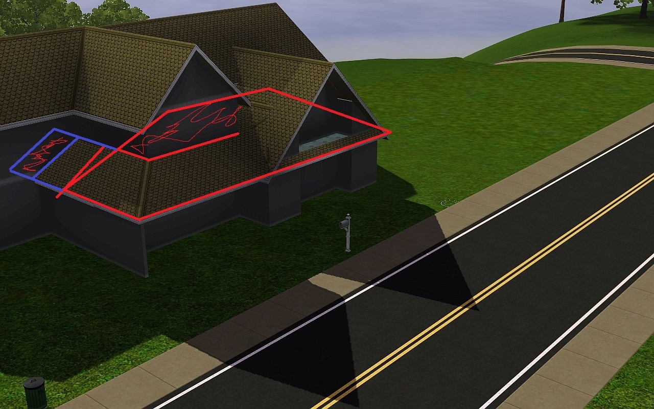
Oh, rereading a bit, I guess i was called forth to comment on the roof. I liked the original color, but either the gray or brown work for me as well. Roof color is so easy for a downloader to change I don't think it's much of an issue. I think the pitch of most of the roof is fine, especially for more of a farmhouse/vernacular type build. Though with a pitch that steep they almost always end in a gable, but I understand that you are trying to distinguish the brick section (possibly older part) from the rest, so for me the hipped roof is good with helping that. Now I would probably lower the the pitch of the porch a bit, and then carry that half gable all the way back to fix what looks like weird gaps (red circles). I would place a little hipped piece (orange) that matches the pitch of the large front gable there to help smooth into the lowered porch roof, and to hide the ends of the gable (purple) that will be more prominent with the lowered porch roof.
As for the chimney, in real life there is the "2 foot, 10 foot, 3 foot" rule. "This rule indicates that the chimney must be at least 2 feet taller than any structure within 10 feet of it and also at least 3 feet higher than the point at which it penetrates the roof." Source. So that is something to consider. (Looking at my own uploads, I have at least five builds that fail that. Some try... but since I like to encase chimneys with walls so I can cast/have fancy tops, I run out of levels or there's a stupid tower nearby. )
)
As for the chimney, in real life there is the "2 foot, 10 foot, 3 foot" rule. "This rule indicates that the chimney must be at least 2 feet taller than any structure within 10 feet of it and also at least 3 feet higher than the point at which it penetrates the roof." Source. So that is something to consider. (Looking at my own uploads, I have at least five builds that fail that. Some try... but since I like to encase chimneys with walls so I can cast/have fancy tops, I run out of levels or there's a stupid tower nearby.
)
#15
9th Feb 2017 at 9:21 PM
Last edited by themysteriouscorn : 11th Feb 2017 at 10:40 PM.
9th Feb 2017 at 9:21 PM
Last edited by themysteriouscorn : 11th Feb 2017 at 10:40 PM.
Posts: 233
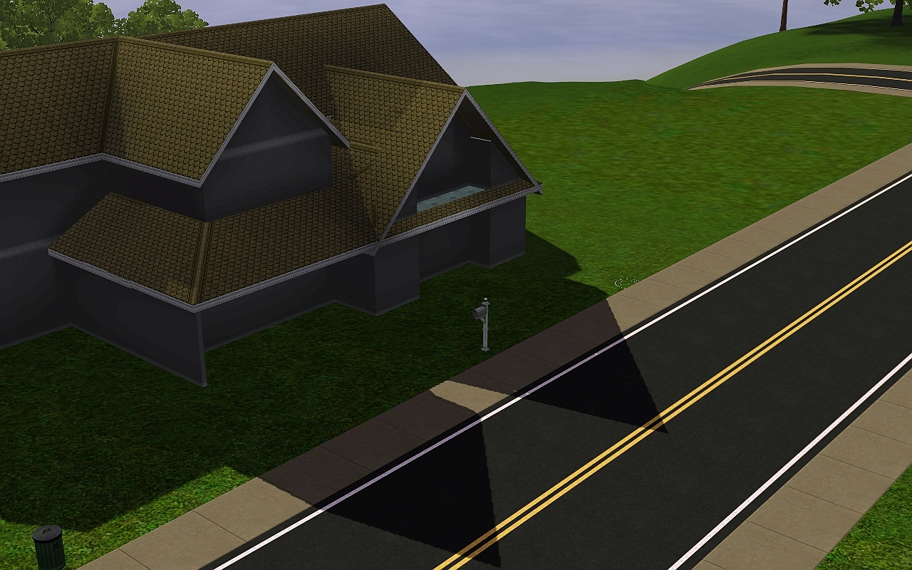
Ok, so I haven't made all the changes yet, but I'm having trouble with the roof suggestions. I'll explain what I mean, here is the top view of the roof before I made changes

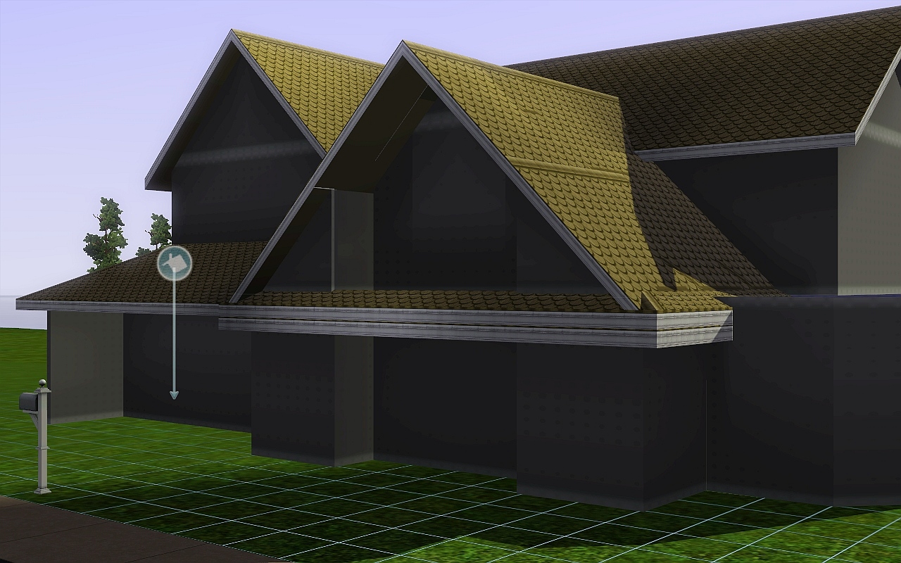
So, I tried to change the front gable roof to a half gable that goes all the way to the wall, as suggested, but this happened

Awkward piece sticking out because 5 x 5 was the smallest size that reached the wall without it completely flipping the other direction.
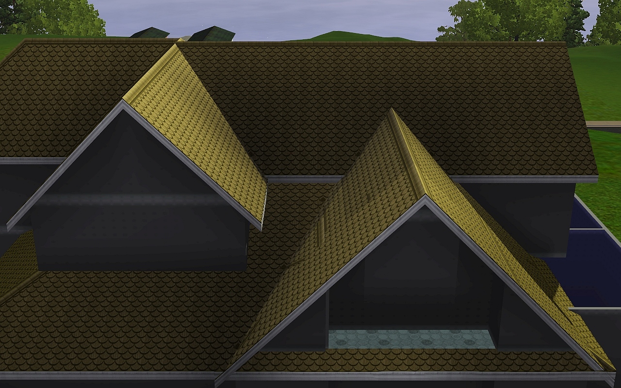
And I can't make the other gable facing out taller because on the next level, there's a smaller gable so there isn't a gap between the top roof and the uppermost roof

If that makes sense..
Anyway, there's also this problem...

The roof doubled up like so, when I added a hipped roof piece that was the same height as the gable as suggested.
And I altered the chimney, gave it a half gable roof and then had the chimney reset to it's correct position

I don't know if it's just me but I feel like it looks too tall and out of place.
I tried shortening it but I don't know if that makes it too short

I'd like a second opinion
I have no idea what to do, and roofs are seriously frustrating.

So, I tried to change the front gable roof to a half gable that goes all the way to the wall, as suggested, but this happened
Awkward piece sticking out because 5 x 5 was the smallest size that reached the wall without it completely flipping the other direction.
And I can't make the other gable facing out taller because on the next level, there's a smaller gable so there isn't a gap between the top roof and the uppermost roof
If that makes sense..
Anyway, there's also this problem...
The roof doubled up like so, when I added a hipped roof piece that was the same height as the gable as suggested.
And I altered the chimney, gave it a half gable roof and then had the chimney reset to it's correct position
I don't know if it's just me but I feel like it looks too tall and out of place.
I tried shortening it but I don't know if that makes it too short
I'd like a second opinion
I have no idea what to do, and roofs are seriously frustrating.


#16
10th Feb 2017 at 2:57 AM
10th Feb 2017 at 2:57 AM
Some things with roofs can't be helped due to game limitations. It is too steep there, lower that and the others connecting to it. I am a sims 2 builder not 4 so I can't help much with the roof except to tell you when it's good enough for the queue.
"I dream of a better tomorrow, where chickens can cross the road and not be questioned about their motives." - Unknown
~Call me Jo~
#17
10th Feb 2017 at 8:55 AM
10th Feb 2017 at 8:55 AM
I'd have to see it all for myself in-game, since experimenting around with pictures isn't really possible. I'll see what I can do when I'm home.
The tall chimney looks out of place, indeed. The second choice looks better
The tall chimney looks out of place, indeed. The second choice looks better
#18
10th Feb 2017 at 4:02 PM
10th Feb 2017 at 4:02 PM
Firstly, I adore the style of the interior :lovestruc although I'd look at recolouring those green curtains.
Externally, the new roof colour looks great and I agree that the second option with the chimney is much better.
What I'm not so keen on is that troublesome front gable with the shingles. Looking at the proportions of all of the other gables present, it just seems so out of place. Personally, I'd get rid of it and duplicate the gable next to it as a replacement. Sorry.if that doesn't make much sense, I can always mock up a model for illustration if that helps?
#19
11th Feb 2017 at 9:40 PM
11th Feb 2017 at 9:40 PM
Can you all use spoilers please, if you have more than 4 pictures. That is [spoiler] picture in here [*spoiler] Replace the * with this /
"I dream of a better tomorrow, where chickens can cross the road and not be questioned about their motives." - Unknown
~Call me Jo~
#20
12th Feb 2017 at 12:06 AM
12th Feb 2017 at 12:06 AM
Sorry, I'm a bit slow getting back here. I was assuming you'd take the half gable the two more tiles all the way over to the edge, sorry if i was unclear. And the little hipped roof suggestion was just to try to disguise the bits circled in purple. You can play around with lowering it a bit or nix it all together--envisioning in my head is not always as accurate as it could be. :P
I really like the wide front gable. (Don't listen to Fergus!)
The second chimney looks excellent.
I really like the wide front gable. (Don't listen to Fergus!
) The second chimney looks excellent.
#21
12th Feb 2017 at 7:02 PM
12th Feb 2017 at 7:02 PM
Alright, I've been slow (And lazy, tbh)
Finding a solution for the roof isn't too hard, but executing it on a fully furnished build is pretty..unpleasant.
The product itself.
Awesome paint skills showing where the roof goes through.
I've used a half hipped roof which I pulled from one end
all the way to the other end, so every gap has been filled. The blue section is a half gabled roof also entering the house.
This section still looks odd, though. It could be due to the roofangle I've used on the upper floor.
As you might know, roofs going through a home aren't a problem as long as there's another roof above it, since that roof will cut out the lower roof intersecting the home and you'll only have to remove the walls caused by them.
Fixing the roof here will be hard with all the furnishing and windows, doors etc. because it will 'interesct' with roof
My suggestion is putting the roof first before completely furnishing, since doors and windows might be the only things intersecting with the roof, and those are easily replaced.
I hope this helps some.
I've attached a picture showing the cut-outs. Indoors is red, green is exterior.
#22
12th Feb 2017 at 7:27 PM
Last edited by themysteriouscorn : 12th Feb 2017 at 11:52 PM.
12th Feb 2017 at 7:27 PM
Last edited by themysteriouscorn : 12th Feb 2017 at 11:52 PM.
Posts: 233
So, thank you everybody for all the help with the roof disaster
I just used the half gable all the way to the end to avoid extra conflict with all the furniture, and I sort of did like five different hipped roof strips with different heights to try to fix the doubled up look problem. It looks sort of strange but I think it's mostly better than before.


I also added a window to the kitchen as suggested, and other than that I think I'll keep the rest the way it is, even though all the suggestions were extremely helpful and it was probably a lot of extra work explaining what changes I should make and then me not making them, and I feel so bad about that, but there were just so many different suggestions and I couldn't do them all! I just hope everyone's happy with the roof now.

So uh... what do I do now? (I'm oblivious )
I just used the half gable all the way to the end to avoid extra conflict with all the furniture, and I sort of did like five different hipped roof strips with different heights to try to fix the doubled up look problem. It looks sort of strange but I think it's mostly better than before.
I also added a window to the kitchen as suggested, and other than that I think I'll keep the rest the way it is, even though all the suggestions were extremely helpful and it was probably a lot of extra work explaining what changes I should make and then me not making them, and I feel so bad about that, but there were just so many different suggestions and I couldn't do them all! I just hope everyone's happy with the roof now.
So uh... what do I do now? (I'm oblivious
#23
13th Feb 2017 at 3:57 AM
13th Feb 2017 at 3:57 AM
Posts: 2,016
Thanks: 2131 in 22 Posts
Hi mysterious (can I call you that?)
First, I have been meaning to mention the pictures. MTS has a rule of no more than 4 inline pics, and if you have more, place under a spoiler. Also, you can upload screenshots directly to a post by using "Go Advance" and then "Image Upload".
It looks really good and READY!!! I guess you have two choices. You can post screenshots on this thread, if you want help, or you can proceed to the (feared) Upload Wizard (under Create>Upload Items): http://upload.modthesims.info/
You should read the Creator Guidelines here: http://www.modthesims.info/wiki.php...ator_Guidelines
Your screenshots are good, but screenshots are the item most likely to trip up a first time uploader. You may want to post at least another overhead shot, before you're off to see the Wizard.
You need a picture from the front of the lot, and an overhead shot of each floor. Of course, pictures sell the lot to downloaders, so you want enough to really showcase the build.
You will need to pick one photo for the main (browsing) picture, and you can have up to 4 large pictures in the description. The rest will be thumbnails along the top.
You need lot size info, ie. 30 X 30.
You need price, furnished and unfurnished.
You need a list of all EPs and SPs used.
You need a list of cc, with links for every creator. I know you used lots of cc so I would suggest dividing it into 2 groups, required and optional.
The upload needs a title.
You need a description, and (optional) a back story.
You will need to list additional credits.
You complete all the bits of the Wizard. It is pretty straightforward, just lots of info. You want to double check the final view, because that will become the download page when it is approved.
You hit submit, you get a PM confirmation that it is in the queue.
There are 3 possible results, reject/ accept/ changes required.
CR (changes required) is common with a first upload. The mod who reviewed it will indicate what changes need to be made.
Let us know how we can help and GOOD LUCK!
#24
13th Feb 2017 at 4:03 AM
13th Feb 2017 at 4:03 AM
Posts: 2,016
Thanks: 2131 in 22 Posts
Testers- just noticed this question.
It is always a good idea to have a sim test the lot. Make sure the routing works. Make sure every single thing a sim uses is actually usable. Sometimes people ask others to test the lot for them, especially if it is a complicated build. Sometimes you just want another set of eyes. If you decide you want testers, you can upload the lot on this thread (using advance options), or you can PM someone and ask them directly to test it, or you can go to the CFF (Creator Feedback Forum) and post the lot there. For your lot it is probably not necessary, but it is an option if you want it.
It is always a good idea to have a sim test the lot. Make sure the routing works. Make sure every single thing a sim uses is actually usable. Sometimes people ask others to test the lot for them, especially if it is a complicated build. Sometimes you just want another set of eyes. If you decide you want testers, you can upload the lot on this thread (using advance options), or you can PM someone and ask them directly to test it, or you can go to the CFF (Creator Feedback Forum) and post the lot there. For your lot it is probably not necessary, but it is an option if you want it.
#25
13th Feb 2017 at 4:13 AM
13th Feb 2017 at 4:13 AM
Please don't use lots of cc if you can help it, we have to check each and every link.
I can tell you right now, this lot is not a reject so relax.
I can tell you right now, this lot is not a reject so relax.
"I dream of a better tomorrow, where chickens can cross the road and not be questioned about their motives." - Unknown
~Call me Jo~
Who Posted
|
|