 Sign in to Mod The Sims
- Site Map >
- Modding and Creation >
- Creator Feedback Forum >
- Sims 3 >
- Lots and Housing - "Terrazo: Modern House" Work In Progress
- Site Map >
- Modding and Creation >
- Creator Feedback Forum >
- Sims 3 >
- Lots and Housing - "Terrazo: Modern House" Work In Progress
Locked thread |
Replies: 13 (Who?), Viewed: 3632 times.
| Locked by: spladoum Reason: Good home designing advice.
#1
 21st Mar 2011 at 4:22 AM
21st Mar 2011 at 4:22 AM
Posts: 331
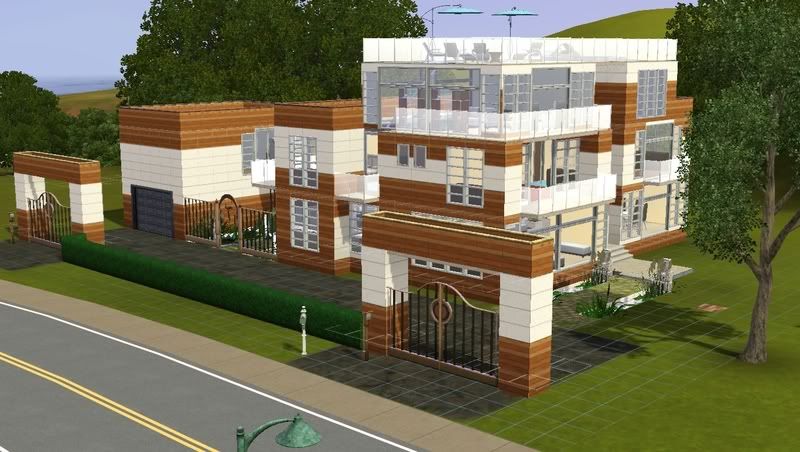
This is Terrazo, a modern home.
View from the street
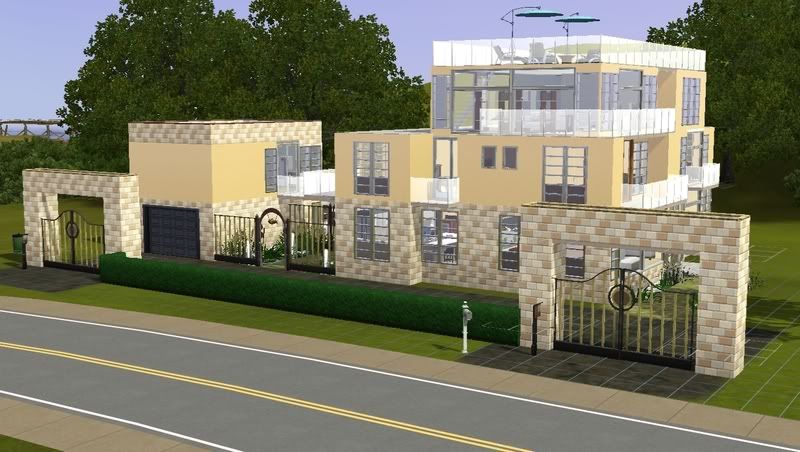
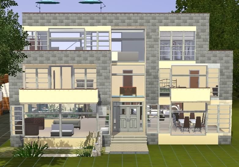
Front of the house
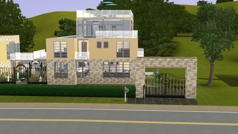
If you come in from the garage, you enter through here
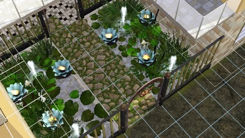
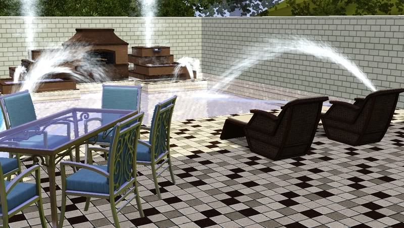
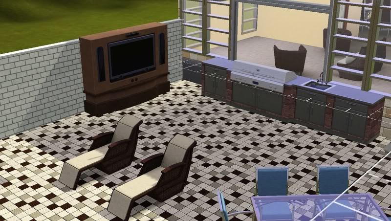
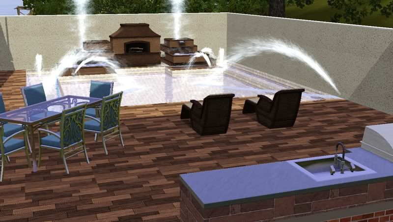
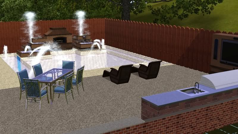
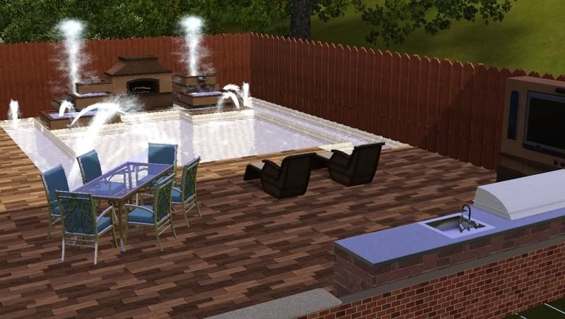
Outdoor area
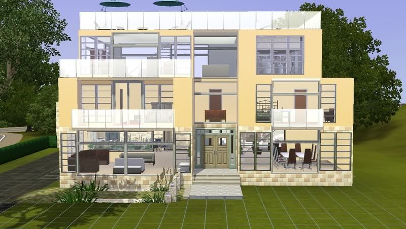
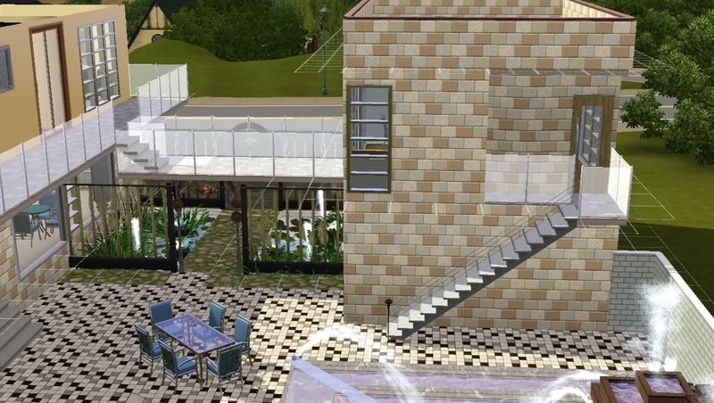
There is a studio over the garage that is connected to the main house by a bridge
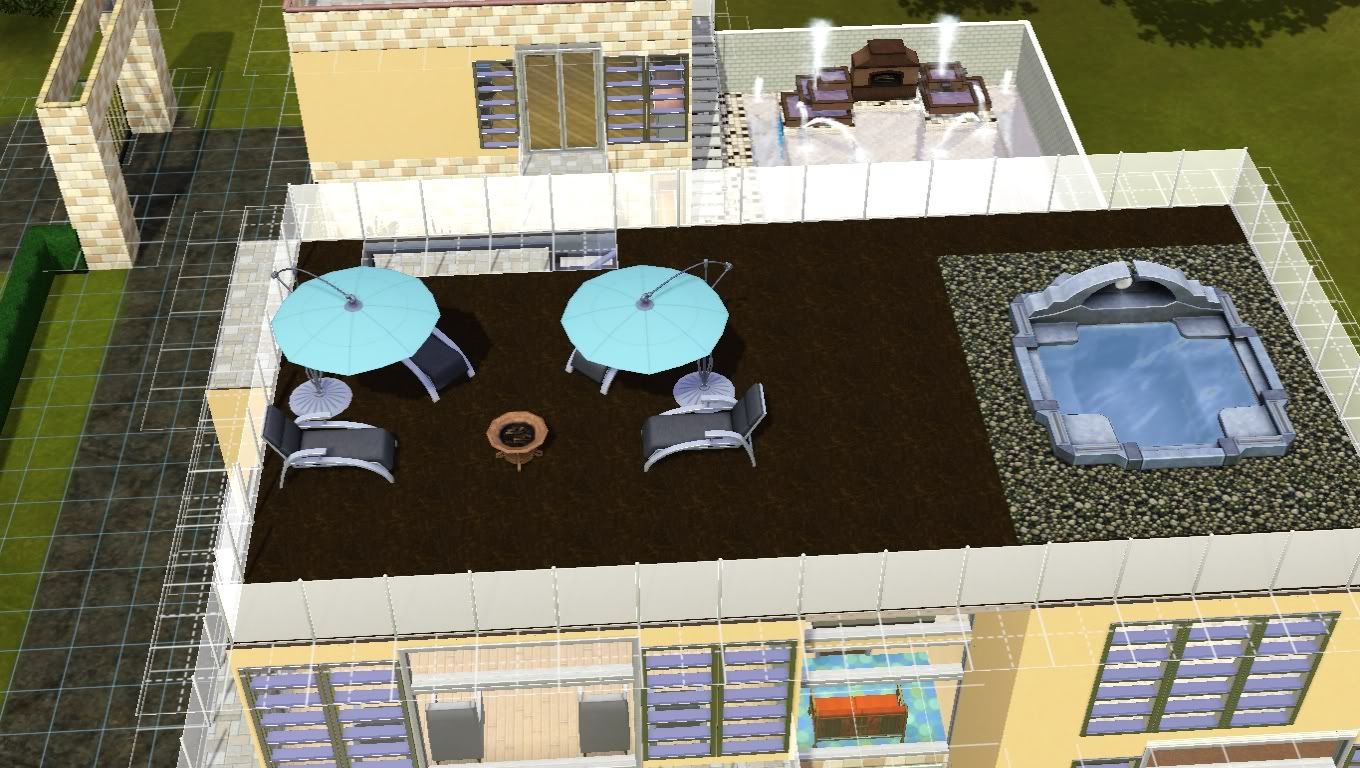
The rooftop is perfect for adult entertainment. No kids LOL
Any feedback and advice is appreciated. Thanks again!

Advertisement

#2
21st Mar 2011 at 6:52 AM
21st Mar 2011 at 6:52 AM
My advice for the exterior would be to work on your colours and textures. There's a lot going on there: I count 6 different floor coverings and 3 different wall coverings plus an additional 2 patterns on the outside kitchen units and pool/fountain. Then there's all the different colours of wood and metals on the doors, windows and fences....there's too many patterns competing for attention. modern houses tend to be about simplicity and good flow which you could easily get if you reduce the amount of fussiness.
If this was my house I would probably choose a fairly simple, neutral stucco type pattern as my base for the walls with perhaps some brick/stone/wood/rich coloured accent walls (not all at the same time, I mean I'd choose one) like you did with the garage walls. Then I'd find a complementary finish for the fittings like the windows and doors. Fences I would either marry with their background (eg if they're against a white wall I'd make them white or light silver maybe) or match them close to the fittings. They wouldn't have to be exact but just not massively clashing, so you could use a different pattern but keep it a similar colour/shade for example.
Floors: if the feel you're going for with the lily pond walkway is an open flow from the front of the house into the patio/entertainment area then I'd make the floors less clashy which only emphasises the seperate sections. Maybe even consider making the ground covering all the same from the back door to the driveway except for lanscaped areas so it flows seamlessly from one area to another? When choosing a floor pattern consider whether it fits in with the modern feel of the rest of the house. I love the slightly overgrown stones you have on the walkway but I think in most cases they couldn't really be considered modern looking.
Those are just examples though, I think the most important thing is to reduce the amount of uncomplementary patterns. Also, regardless of what I've said above, make sure if and when you make changes you're happy with the results and not just doing it because somebody else says it will look good
I love a lot of the ideas you have going on in the exterior, especially the picturesque little lily pond area. I really like the raised walkway between buildings too and the fact that you've managed to steer clear of square buildings which is something I'm often guilty of, lol.
Guys, rules are good! Rules help control the fun. ~ Monica E. Geller
#3
21st Mar 2011 at 7:20 AM
21st Mar 2011 at 7:20 AM
Posts: 331
Thanks for the feedback! I appreciate the time you took to type that out 
I guess I just have to spend a lot of time matching floors and walls and finding ones that look good together LOL When I build I just slap on whatever and leave it at that but in order to make the house attractive I need to spend more time on the aesthetics.
I guess I just have to spend a lot of time matching floors and walls and finding ones that look good together LOL When I build I just slap on whatever and leave it at that but in order to make the house attractive I need to spend more time on the aesthetics.
#4
21st Mar 2011 at 8:18 AM
21st Mar 2011 at 8:18 AM
Cannot see the pictures
#5
21st Mar 2011 at 10:12 AM
21st Mar 2011 at 10:12 AM
Posts: 331
adonispluto, I don't know why you can't see the pictures. 
So I changed the obvious eye sores
It looks much better to me but I don't know it still lacks "omph"
Just to show the more subdued floortiles.
Can't decide on what looks best
Stone fence, wooden floor
wooden fence, stone floor
wooden fence, wooden floor

So I changed the obvious eye sores
It looks much better to me but I don't know it still lacks "omph"
Just to show the more subdued floortiles.
Can't decide on what looks best
Stone fence, wooden floor
wooden fence, stone floor
wooden fence, wooden floor
#6
22nd Mar 2011 at 3:58 AM
22nd Mar 2011 at 3:58 AM
Posts: 466
Thanks: 9896 in 9 Posts
I think the stone fence and wood floor looks the best but I would change the wood floor to something more even and lighter and less busy.
I think your exterior wall coverings aren't right yet either, you used too much of the same.
Try some light stucco/paint for the whole house first, then use maybe some brick/siding for accent here and there, something not too dark and see how that looks.
I would play around with different colors and maybe you find a combination you like.
You can find more of my stuff here: http://www.blackpearlsims.com/downloads.php
#7
22nd Mar 2011 at 4:05 AM
22nd Mar 2011 at 4:05 AM
Posts: 120
Thanks: 738 in 21 Posts
With the house colors, a tip I learned is that, even though it's tedious, try out and take pictures of all sorts of combinations. Once you look at them all next to eachother, you start to see what you like. I'd go with ~Dee~ on the wood floors deal. Deffinately makes the stove pop with the stone fence.
#8
22nd Mar 2011 at 12:58 PM
22nd Mar 2011 at 12:58 PM
Posts: 331
So I played around for a bit, taking in consideration the suggestions I've gotten, which I appreciate a lot. I would be lost without them... I'm still lost LOL but not as much.
Exterior which is better?
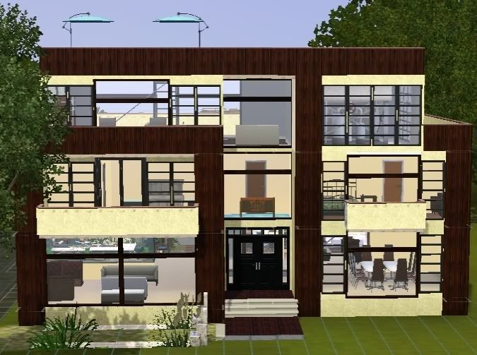
Personally I like the second one more, I darkened the windows and doors to make them pop and deleted some windows in that pic.
The backyard
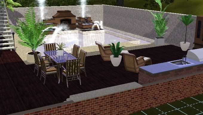
Added some greenery and changed the wooden floor. Is it too dark now?
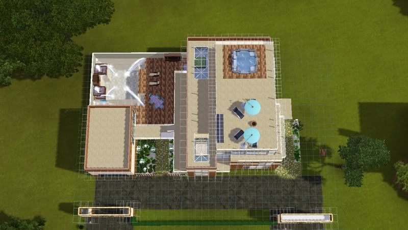
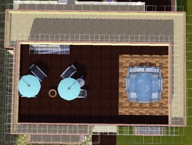
Just for fun, here's the floor plan. Please ignore the furniture, I was just placing them for marking and figure out better furniture placement and to mark the areas.
1st floor
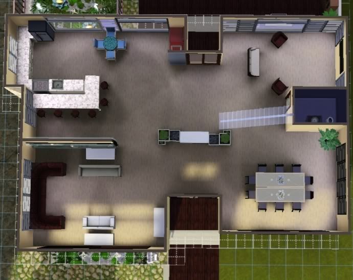
Living area, dining room, kitchen, family area
2nd floor
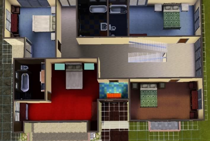
Master BR, 3 BR
3rd floor
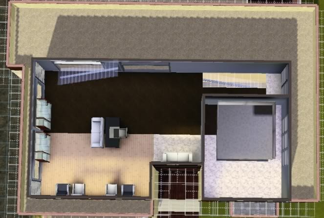
Office/library/rec room
Rooftop
TIA!
Exterior which is better?
Personally I like the second one more, I darkened the windows and doors to make them pop and deleted some windows in that pic.
The backyard
Added some greenery and changed the wooden floor. Is it too dark now?
Just for fun, here's the floor plan. Please ignore the furniture, I was just placing them for marking and figure out better furniture placement and to mark the areas.
1st floor
Living area, dining room, kitchen, family area
2nd floor
Master BR, 3 BR
3rd floor
Office/library/rec room
Rooftop
TIA!
#9
22nd Mar 2011 at 1:29 PM
22nd Mar 2011 at 1:29 PM
Posts: 266
Thanks: 11895 in 66 Posts
As for the exteriorcolors, I think there's still too much going on. The wood is too dark and the yellow too yellow.
You should make like the whooole building white-ish (use paint as material (youknowinrecoloring) and use a subtle one with some texture. not one were it's only white without any texture)
and THEN you should make some parts of the building an other color. Like stickingout parts. But I wouldn't suggest you use this dark wood. You know, at panneling (i believe it's called that way) there's almost at the bottom this red panneling. Without the white. Use that one and recolor it to light brown. You could also use brick.
If you don't understand what I mean, I'll show you a picture the next time. Just tell me.
(You could also look at my lovely little modern house. It's also two colors, but subtle. I think.)
"And there will come a time, you'll see, with no more tears and love will not break your heart, but dismiss your fears." ~ Mumford & Sons
You should make like the whooole building white-ish (use paint as material (youknowinrecoloring) and use a subtle one with some texture. not one were it's only white without any texture)
and THEN you should make some parts of the building an other color. Like stickingout parts. But I wouldn't suggest you use this dark wood. You know, at panneling (i believe it's called that way) there's almost at the bottom this red panneling. Without the white. Use that one and recolor it to light brown. You could also use brick.
If you don't understand what I mean, I'll show you a picture the next time. Just tell me.
(You could also look at my lovely little modern house. It's also two colors, but subtle. I think.
)
"And there will come a time, you'll see, with no more tears and love will not break your heart, but dismiss your fears." ~ Mumford & Sons
#10
22nd Mar 2011 at 5:01 PM
22nd Mar 2011 at 5:01 PM
Posts: 331
By "parts sticking out" what do you mean? Like the just the sides?
#11
22nd Mar 2011 at 5:10 PM
22nd Mar 2011 at 5:10 PM
Posts: 266
Thanks: 11895 in 66 Posts
Well, like this.
---------|___|------
And then you paint that 'sticking' out part.
But you can also color the second floor in one color and the first floor white.
Just don't make all these little colored areas, try putting more together to make it subtle.
"And there will come a time, you'll see, with no more tears and love will not break your heart, but dismiss your fears." ~ Mumford & Sons
#12
22nd Mar 2011 at 5:30 PM
22nd Mar 2011 at 5:30 PM
Posts: 331
Thanks I will try that out
#13
22nd Mar 2011 at 7:43 PM
22nd Mar 2011 at 7:43 PM
Posts: 292
The lighter wood on post #5 looked much better, imo. That color scheme is pretty nice. Only the lighter part's texture is too busy - and so is the current wooden floor you're using. That floor has several color shades. The windows also have too much going on - too many bars here and there and I think that for a modern look you need something more minimalistic and clean looking. Also, I agree with nikkicornelisse on the "the yellow is too yellow".
The gates are a pretty interesting feature. But so far the rest of the design is kinda bland, you know? :/ Maybe you could try playing around with different doors/windows/fences (those on the building, not the gates) and post some of your combinations so we can take a look.
You want to know the Secret... so did I. Low in the dust I sought it, and on high. No agony of any mortal brain shall wrest the secret of the life of man. The Search has taught me that the Search is vain.
#14
23rd Mar 2011 at 3:52 AM
23rd Mar 2011 at 3:52 AM
Posts: 331
Thanks ChaoticNeutral for your input.
As for the doors/windows there's not much I can think of to use since I don't wanna use CC for the house. But I'm still on the fence about whether to keep it CC free or not. I have recently found some great CC items, like the plants in the pool area.
As for the doors/windows there's not much I can think of to use since I don't wanna use CC for the house. But I'm still on the fence about whether to keep it CC free or not. I have recently found some great CC items, like the plants in the pool area.
| Locked thread | Locked by: spladoum Reason: Good home designing advice. |
Who Posted
|
|