 Sign in to Mod The Sims
- Site Map >
- Modding and Creation >
- Creator Feedback Forum >
- Sims 3 >
- Lots and Housing - 10x10 family home
- Site Map >
- Modding and Creation >
- Creator Feedback Forum >
- Sims 3 >
- Lots and Housing - 10x10 family home
Locked thread |
Replies: 12 (Who?), Viewed: 2556 times.
| Locked by: Yogi-Tea Reason: old - will re-open if requested (contains useful info)
#1
 5th Dec 2013 at 2:14 PM
5th Dec 2013 at 2:14 PM
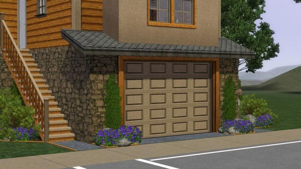
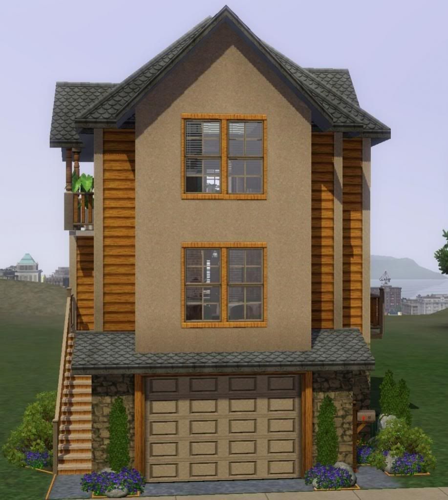
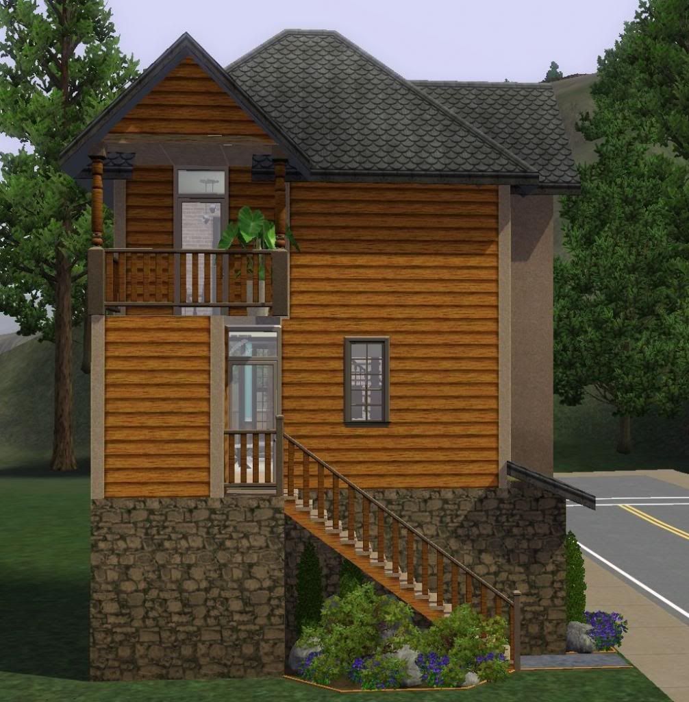
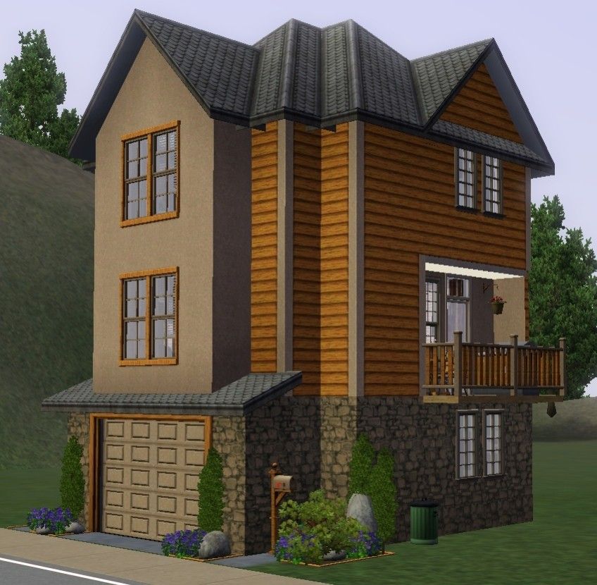
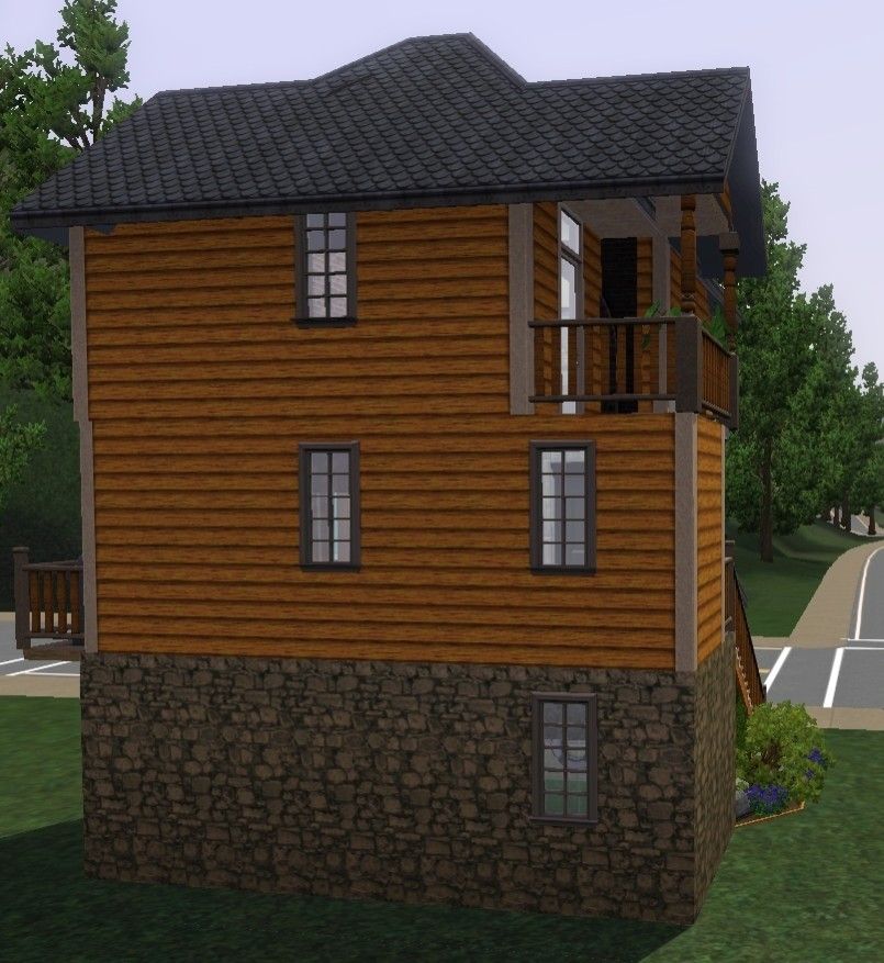
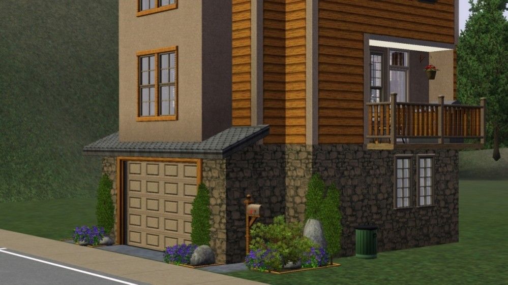
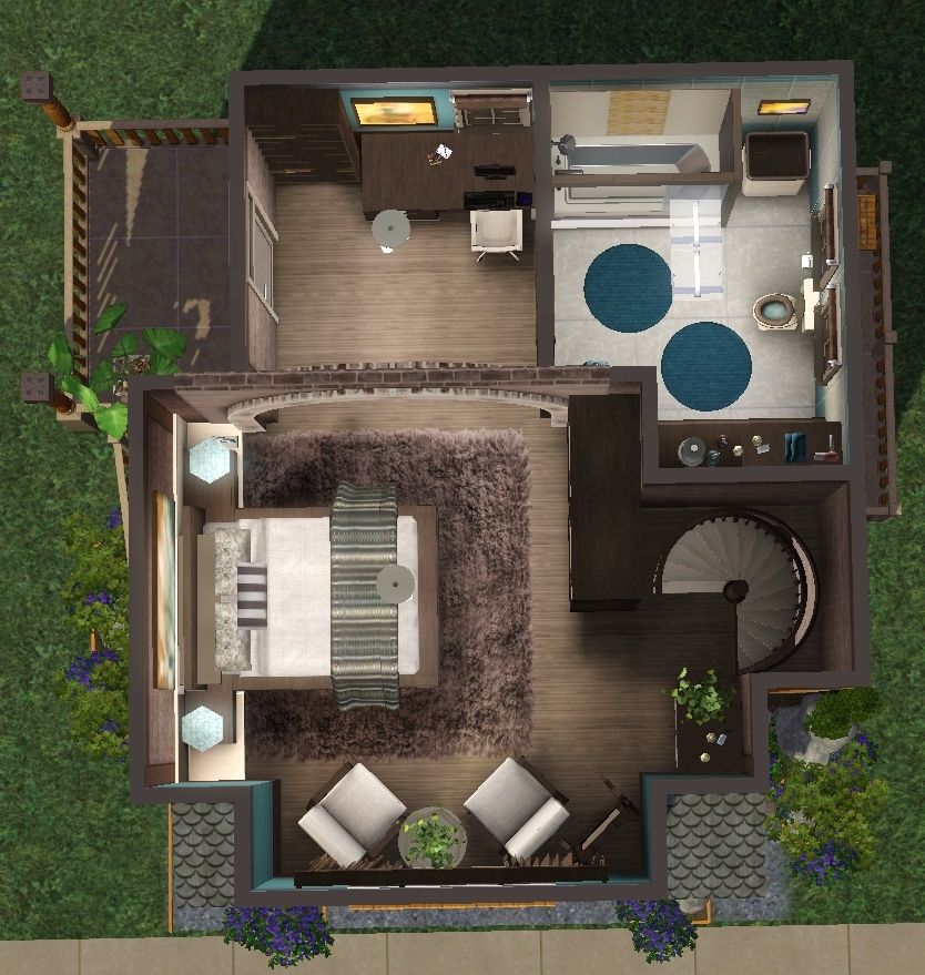
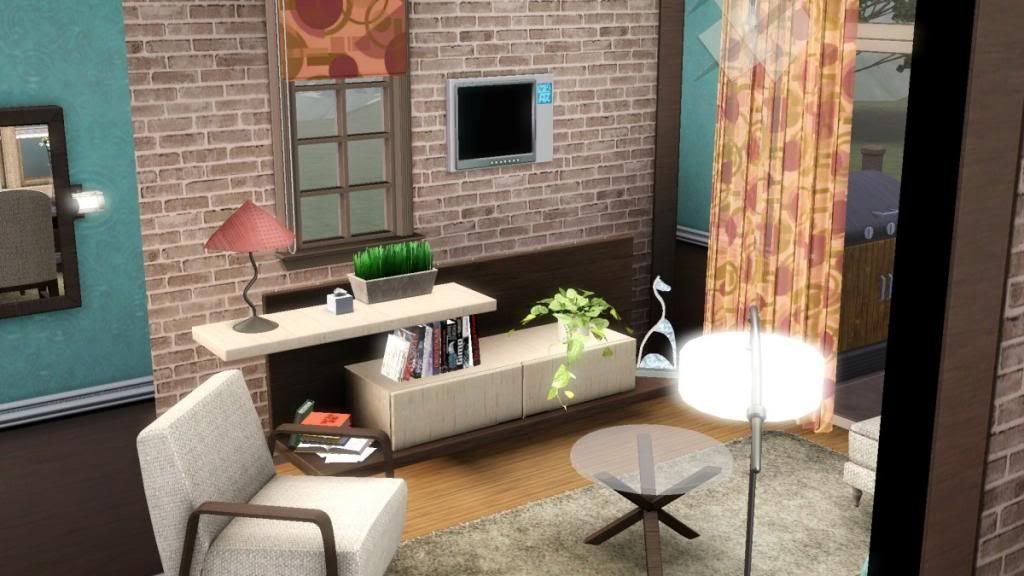
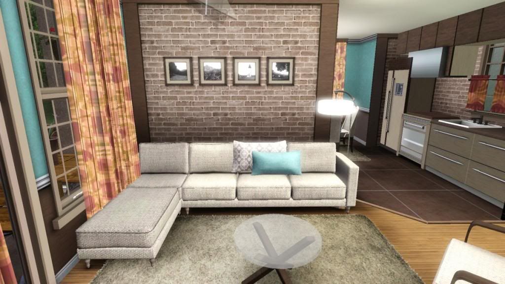
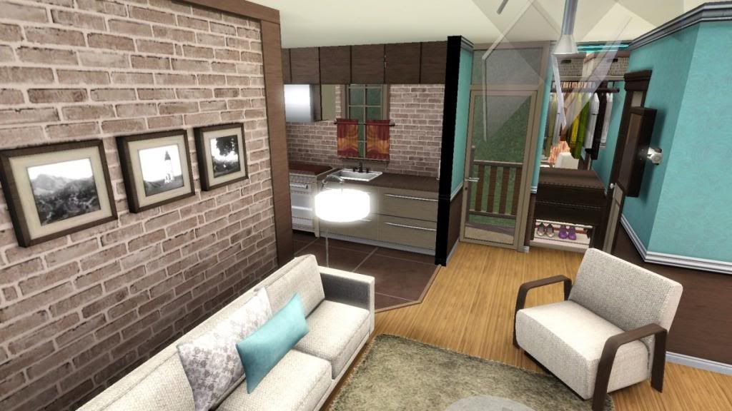
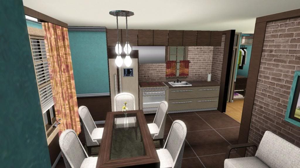
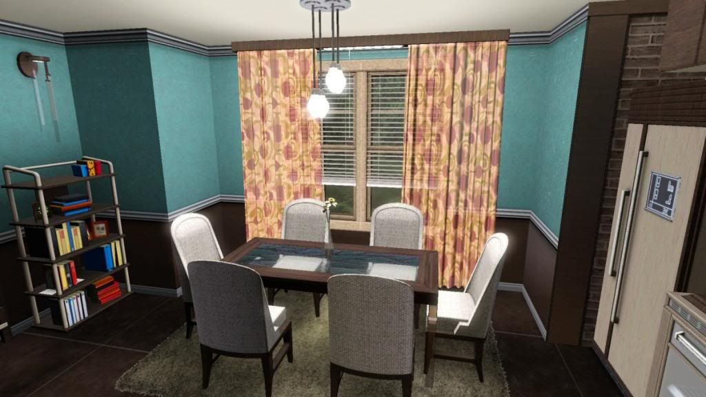
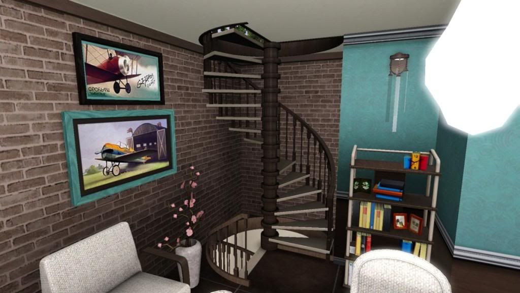
Pictures here:
exterior


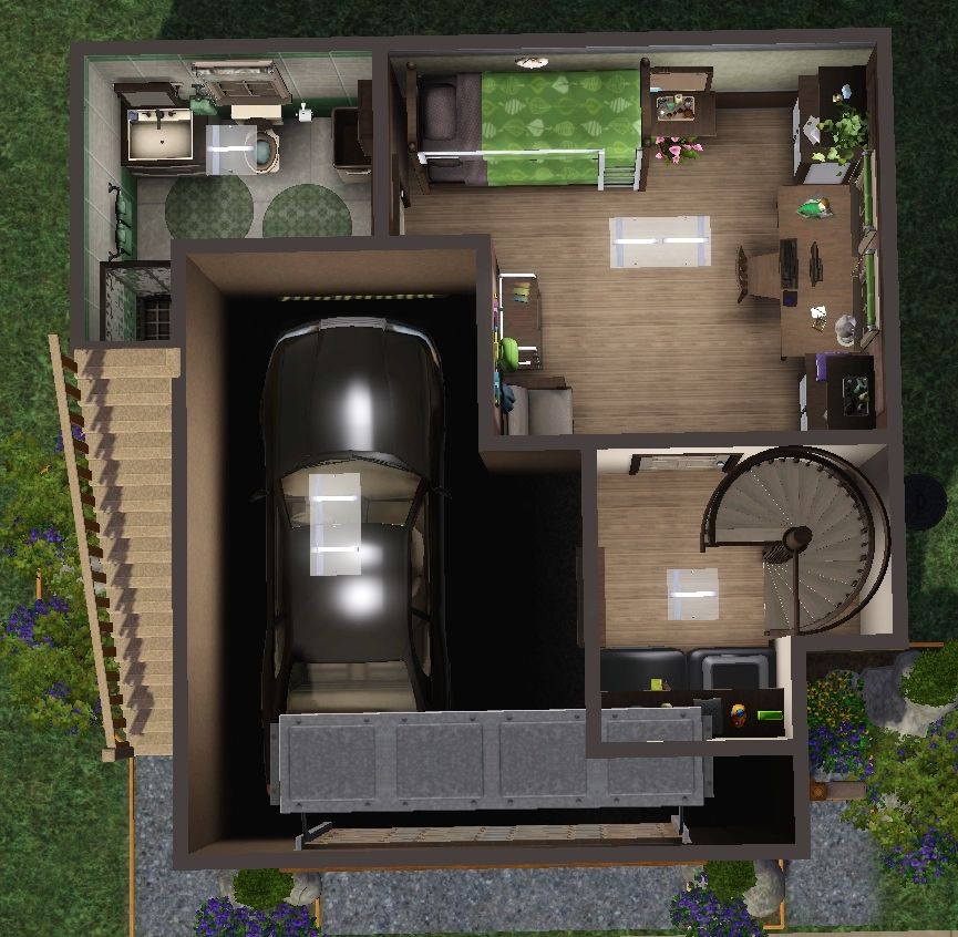
floor plans


Living, dining, kitchen


master bedroom


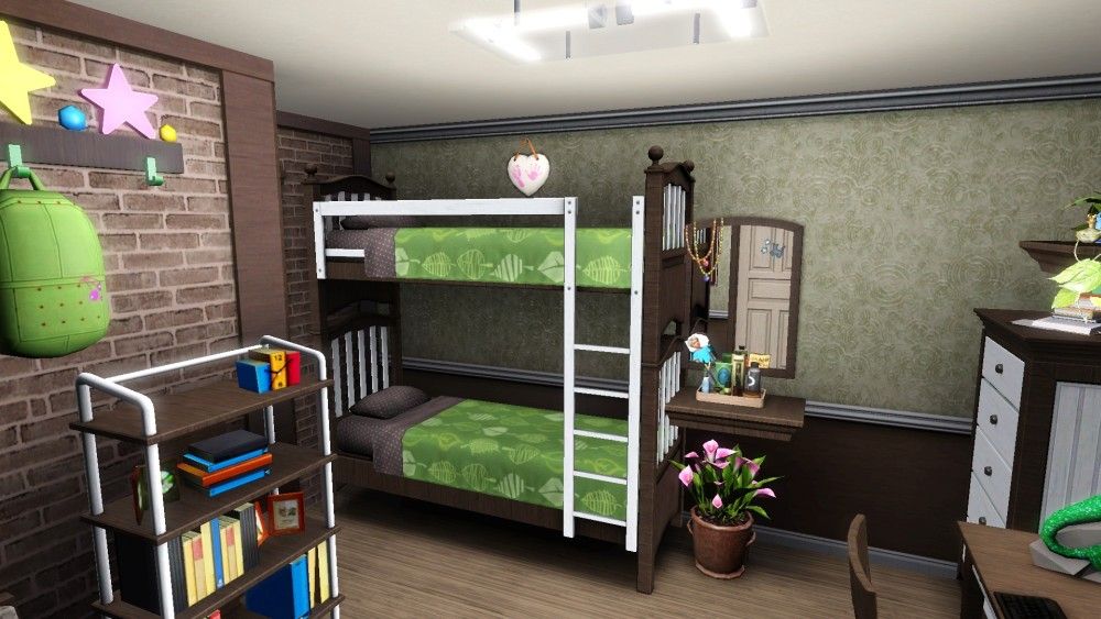
kids room


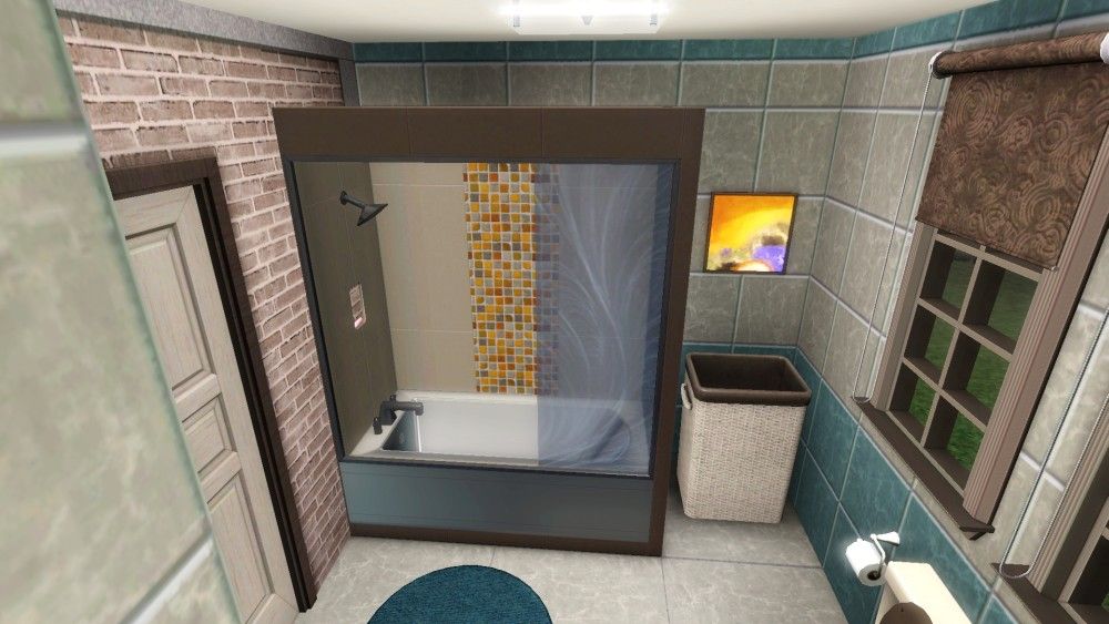
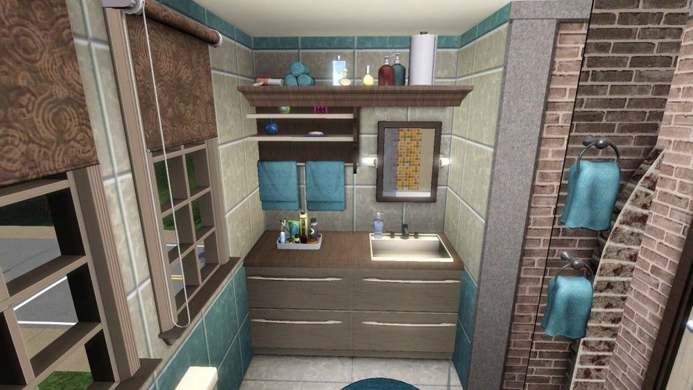
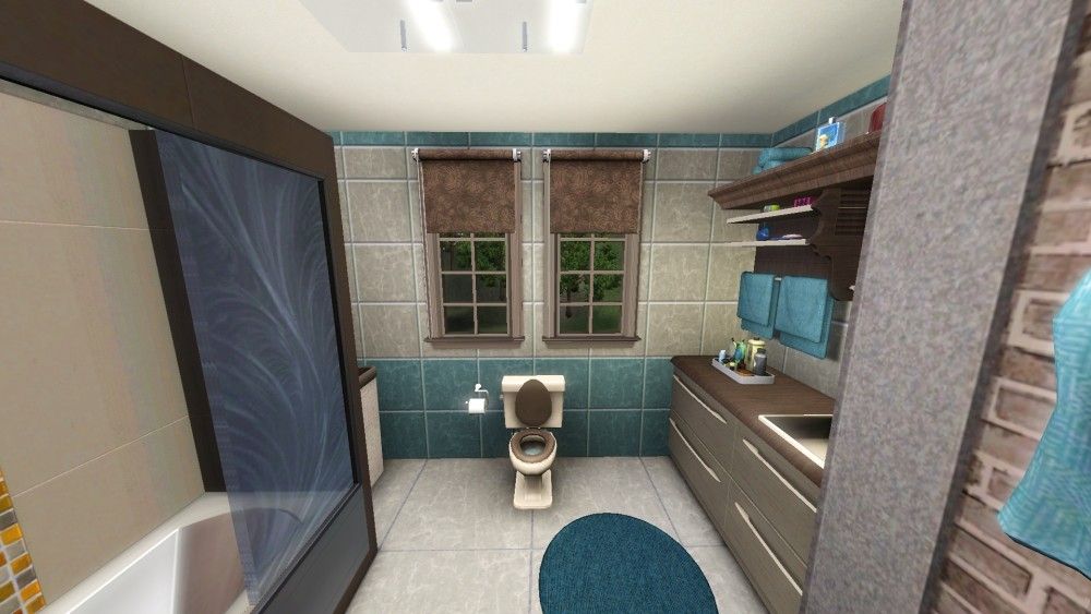
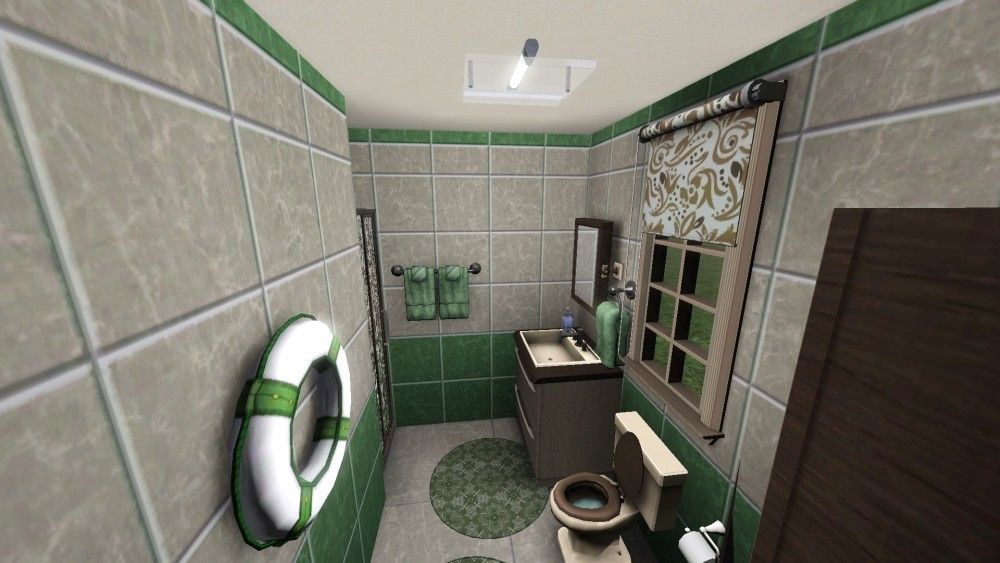
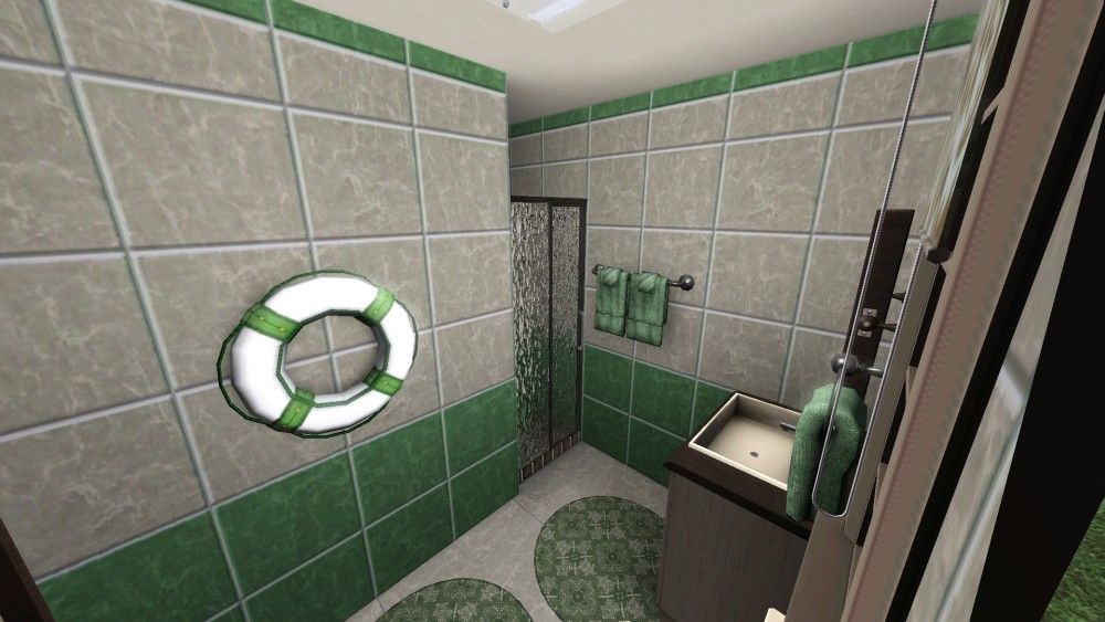
master bathroom (not finished yet)


Advertisement
#2
6th Dec 2013 at 10:47 AM
6th Dec 2013 at 10:47 AM
Good start! This looks very promising and I think you only need to tweak little things to be able to finish it.
The first thing I noticed (because this is a pet peeve of mine, I hope it doesn't sound nitpicky!) is the plant in the master bedroom clipping through the walls. I would suggest trying to find a smaller plant, or placing it off-grid and further away from the walls.
Secondly, I think the color of the roof doesn't match the walls, I would try a grey slate type of thing (don't have my game installed in English, so not sure what it's called, hope you know what I mean!)
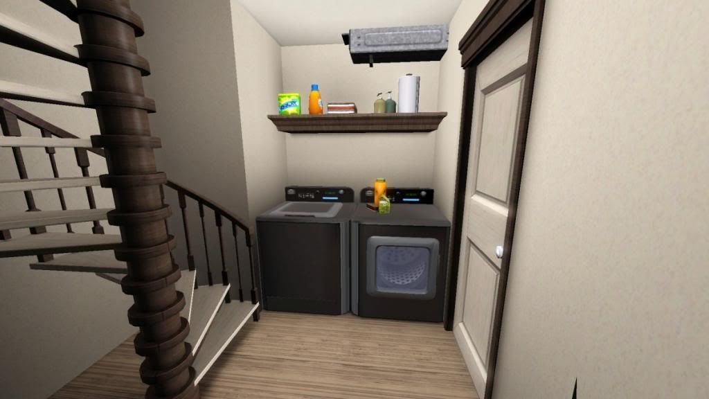
I also was wondering whether you have playtested the lot, to check for any routing issues. Does the placement of the laundryroom, mailbox and trashcan cause any errors?
I'm impressed at how much you have managed to build in such a tiny space, and I think you have choosen an interesting color scheme
As I said, it's just little stuff that needs tweaking, are you planning to upload it here?
The first thing I noticed (because this is a pet peeve of mine, I hope it doesn't sound nitpicky!) is the plant in the master bedroom clipping through the walls. I would suggest trying to find a smaller plant, or placing it off-grid and further away from the walls.
Secondly, I think the color of the roof doesn't match the walls, I would try a grey slate type of thing (don't have my game installed in English, so not sure what it's called, hope you know what I mean!)
I also was wondering whether you have playtested the lot, to check for any routing issues. Does the placement of the laundryroom, mailbox and trashcan cause any errors?
I'm impressed at how much you have managed to build in such a tiny space, and I think you have choosen an interesting color scheme

As I said, it's just little stuff that needs tweaking, are you planning to upload it here?

#3
6th Dec 2013 at 11:04 AM
6th Dec 2013 at 11:04 AM
Posts: 699
Thanks: 16891 in 36 Posts
Nice house! Again, I absolutely adore your decorating style. However, I do agree with the recommendations Klaartje68 made. The roof color does seem to clash a bit with the exterior wall color, and the plant thing is a little pet peeve of mine too. I also want to suggest that you place those two columns on that third story balcony over the outer posts of the fence. If you turn the moveobjects cheat on, they should go right over them without an issue. Also, I noticed that there's a small gap between those columns and the roof. You can fix that by flooring the tiles above the balcony, and the little edge that comes up is CAStable as well, if that's a concern at all.
Overall, I really like it though! That color on the outside is not one I've seen used like that before, but I must admit that I quite love it. I think my favorite part is the master bedroom though. So pretty!
However, I do agree with the recommendations Klaartje68 made. The roof color does seem to clash a bit with the exterior wall color, and the plant thing is a little pet peeve of mine too. I also want to suggest that you place those two columns on that third story balcony over the outer posts of the fence. If you turn the moveobjects cheat on, they should go right over them without an issue. Also, I noticed that there's a small gap between those columns and the roof. You can fix that by flooring the tiles above the balcony, and the little edge that comes up is CAStable as well, if that's a concern at all.Overall, I really like it though! That color on the outside is not one I've seen used like that before, but I must admit that I quite love it. I think my favorite part is the master bedroom though. So pretty!
#4
6th Dec 2013 at 11:07 PM
6th Dec 2013 at 11:07 PM
Posts: 566
Thanks: 9595 in 66 Posts
I agree with the points made by Klaartje68 and Buckley. I also think that fab blue siding would look a lot sharper with a crisp painted white trim, rather than white-ish wood tone.
#5
7th Dec 2013 at 10:02 AM
7th Dec 2013 at 10:02 AM
Klaaratje:I will replace plant in master bedroom with another one or move this one.
I will try grey roof.
Buckley: I will fix the balcony.
k2m1too: Did you mean the edges of the house should be white? What should I do with the windows then?
I playtested the house and everything looks fine. They can do laundry, cooking, eating, barbecue and eating on balcony. Only thing is not working is the dresser in the master bedroom, I don't know why, maybe because it is cc and it should only be decorative?
I will replace some of cc: wall art in the bedroom and dining, end table in the kids room and lamp in the dining.
I didnt upload anything a long time, is now allowed to use TSR cc?
Did I used too much of cc?
List of cc:
Bedroom is set from ung 999, some items from set are used in the livingroom http://www.thesimsresource.com/arti...oom/id/1182193/
Sofa and lounge in the livingroom is from this set http://www.thesimsresource.com/arti...ing/id/1168382/
Rugs in the livingroom and dining http://www.thesimsresource.com/arti...ted/id/1163407/
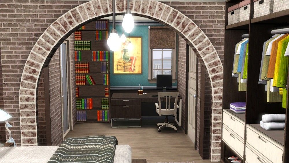
Arch in the bedroom http://www.thesimsresource.com/down...-on/id/1168884/
Kitchen cabinet and hood is from here http://www.thesimsresource.com/artists/SIMcredible!/downloads/details/category/sims3-sets-objects-kitchen/title/astraea/id/1151660/
I also used planters, curtain and blinds from tsr..
That is one set and 10 other items, is that too much?
I will try grey roof.
Buckley: I will fix the balcony.
k2m1too: Did you mean the edges of the house should be white? What should I do with the windows then?
I playtested the house and everything looks fine. They can do laundry, cooking, eating, barbecue and eating on balcony. Only thing is not working is the dresser in the master bedroom, I don't know why, maybe because it is cc and it should only be decorative?
I will replace some of cc: wall art in the bedroom and dining, end table in the kids room and lamp in the dining.
I didnt upload anything a long time, is now allowed to use TSR cc?
Did I used too much of cc?
List of cc:
Bedroom is set from ung 999, some items from set are used in the livingroom http://www.thesimsresource.com/arti...oom/id/1182193/
Sofa and lounge in the livingroom is from this set http://www.thesimsresource.com/arti...ing/id/1168382/
Rugs in the livingroom and dining http://www.thesimsresource.com/arti...ted/id/1163407/
Arch in the bedroom http://www.thesimsresource.com/down...-on/id/1168884/
Kitchen cabinet and hood is from here http://www.thesimsresource.com/artists/SIMcredible!/downloads/details/category/sims3-sets-objects-kitchen/title/astraea/id/1151660/
I also used planters, curtain and blinds from tsr..
That is one set and 10 other items, is that too much?
#6
7th Dec 2013 at 12:32 PM
7th Dec 2013 at 12:32 PM
Posts: 566
Thanks: 9595 in 66 Posts
Sorry, I wasn't clear. By "trim", I meant anywhere that you have that pink-ish/white-ish wood tone - the corners of the siding, the window and door casings, etc.
#7
8th Dec 2013 at 1:27 PM
8th Dec 2013 at 1:27 PM
It is now allowed to use TSR cc in uploads, since they have made everything freely available for download. You do of course have to check the original creator's TOU to check whether you can include or have to link to the download.
The amount of cc you include is at the end of the day a personal opinion and you should decide when it's too much. It is your lot after all, so do what you feel comfortable with. But here are my two cents:
I am not saying this to be mean, but if I saw a lot with this much CC in it, I probably would not download it. I would have to make a decision not only about the lot, but also about the CC, whether I like it, or if I need to take it out when installing etc. I think it's also not so much about the number of CC-items that are included (in general, not your upload specifically) but how it enhances the lot. If you look at this lot for example, all the CC that has been used are build-items, that significantly change the look of the lot to something that you can simply not achieve with EA content. In your case, the CC you have used is to create a particular interior 'style'. (Note: I'm not saying that there's anything wrong with that, there's no right or wrong way when building, only personal preference). I think interior decoration is the thing that downloaders will fiddle most with when downloading your lot, so it might put people off if they have to download a ton of CC that they might change anyways. I would suggest you try to keep only the CC that you deem essential for your style (like for instance the arch in the bedroom) and try to swap things with EA stuff and CASt them to match your style. I hope this all makes sense...
About the dresser: it doesn't work because the creator has made it as a decorative item, so I would definitely change that to a functional dresser.
Looking forward to the next update!
#8
13th Dec 2013 at 1:20 PM
13th Dec 2013 at 1:20 PM
I completely change the exterior and I like it now. Also did some changes in the interior and I think I'm almost finished now. What do you think?
Pictures here:
exterior
floor plans
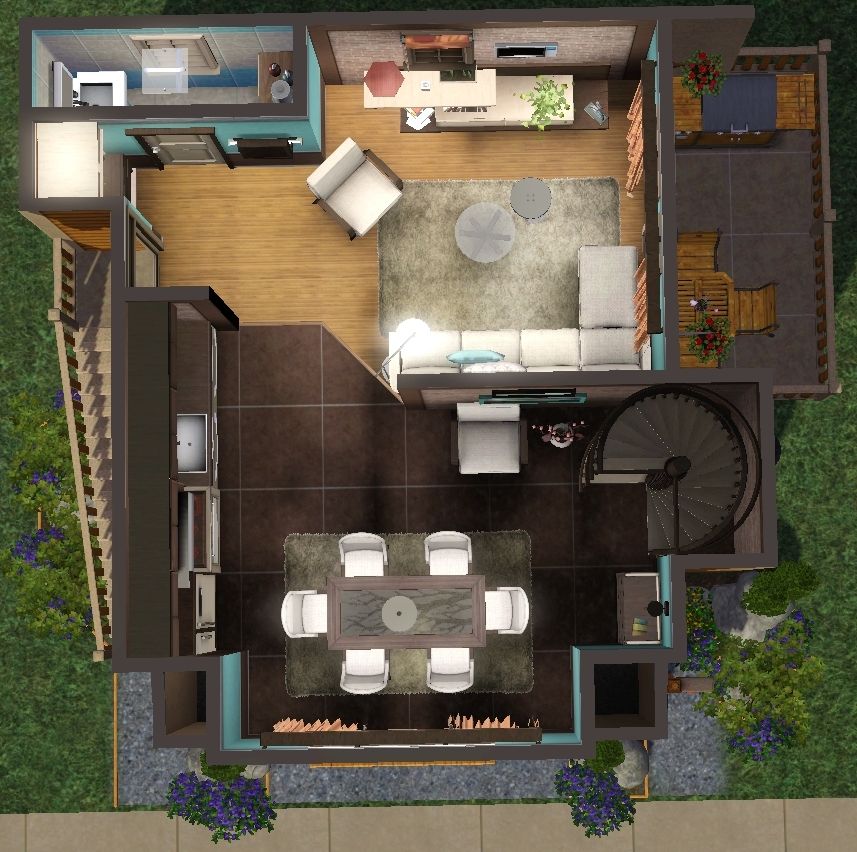
Living, dining, kitchen
master bedroom
master bathroom
kids room
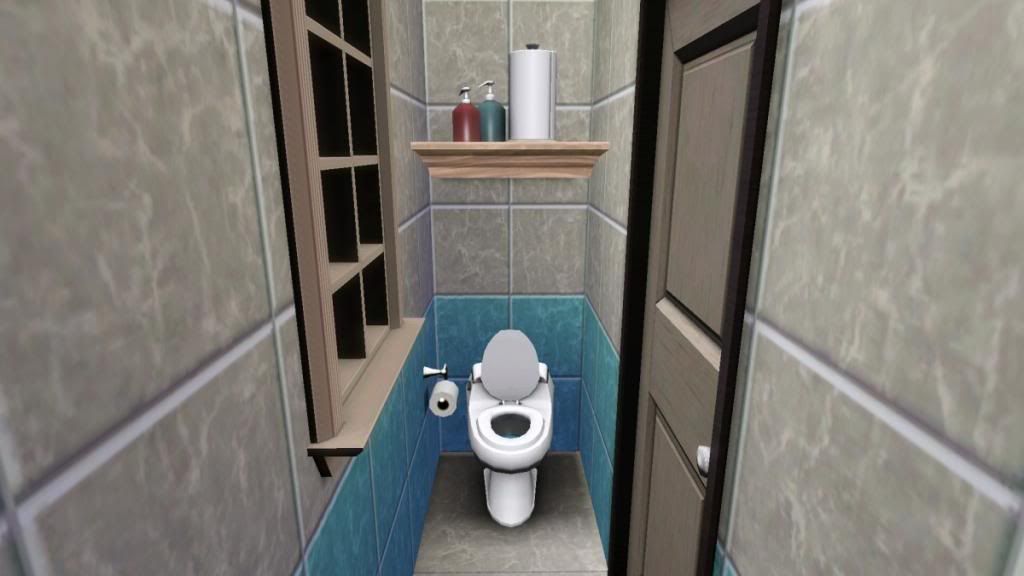
kids bathroom
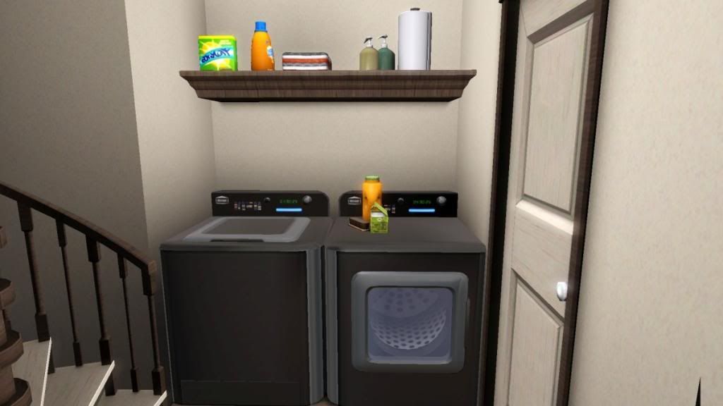
laundry, half bath
Things to do:
lower the front roof
Remove cooker hood and replace it with kitchen cabinet
Place garden lamp
Does the laundry looks weird? Should I put the wall where laundry is and move laundry in the garage?
List of cc:
Bedroom set from ung 999 here
Bedroom arch here
Livingroom sofa here
Livingroom lounge here
Brick pattern from ung999 here
Decorative:
Kitchen wall cabinet here
Living and dining room rug here
plant from ung here
curtains from ung999 left here
right here
Pictures here:
exterior


floor plans


Living, dining, kitchen


master bedroom


master bathroom


kids room


kids bathroom


laundry, half bath


Things to do:
lower the front roof
Remove cooker hood and replace it with kitchen cabinet
Place garden lamp
Does the laundry looks weird? Should I put the wall where laundry is and move laundry in the garage?
List of cc:
Bedroom set from ung 999 here
Bedroom arch here
Livingroom sofa here
Livingroom lounge here
Brick pattern from ung999 here
Decorative:
Kitchen wall cabinet here
Living and dining room rug here
plant from ung here
curtains from ung999 left here
right here
#9
14th Dec 2013 at 9:40 AM
14th Dec 2013 at 9:40 AM
I also need help with the name for house?
Thanks
Thanks
#10
14th Dec 2013 at 1:14 PM
14th Dec 2013 at 1:14 PM
One small detail. Your garage floor is waaay too dark. you should try lightening it up a bit.
Also, here is a cool link to a house name generator if you want to try what they come up with. house name generator
Also, here is a cool link to a house name generator if you want to try what they come up with. house name generator
#11
14th Dec 2013 at 8:26 PM
14th Dec 2013 at 8:26 PM
I like the revamped exterior, looks very coherent, well done! I would leave the laundry room where it is, I think it makes more sense there than in the garage.
Cool website levini, thanks for the link!
I would leave the laundry room where it is, I think it makes more sense there than in the garage. Cool website levini, thanks for the link!
#12
15th Dec 2013 at 3:16 PM
15th Dec 2013 at 3:16 PM
Posts: 699
Thanks: 16891 in 36 Posts
I really like the changes you've made! I do have a few minor suggestions though.
Other than that, I think it's a great lot! I'm quite impressed by the layout especially, as I personally always struggle with smaller spaces. As for names, I use this site a lot. It's honestly not set up that well, but if you don't mind poking around a bit it has some decent ideas.
- This is probably me just being nit picky, but I've noticed that a lot of your wood patterns seem to be turned the wrong way. For example, on the trim around the windows above the garage, the wood grain is running perpendicular to the frame instead of parallel with it. If that was done on purpose then just ignore this comment, but I think it'd look nicer and cleaner if you turned it the other way. Most wood patterns have two presets, so to fix it all you need to do is choose the preset with the grain that runs opposite to how you have it now. I see a few other areas like that as well, both on the interior and exterior, but the bit around the windows is the most obvious spot.
- I absolutely adore most of your design choices, but the one thing that I'm not too fond of is the pattern and colors you're using on the curtains in the living room, dining room, and kitchen. I actually think that peachy/orange color on the background could work quite well in there, but I don't like it mixed with the reds/pinks/yellows in the rest of the pattern. Of course, if you like it a lot, then please, please, please leave it (cause it's your house after all! ), but I might try to tweak it some more if it were up to me.
- For the laundry, I would suggest bumping that wall back one tile and flipping them around so that they're in the garage. Maybe it's just because the last two places I've lived have had the laundry out in the garage, but I think that layout would be preferable to keeping them in the hallway like you have it now.
Other than that, I think it's a great lot!
I'm quite impressed by the layout especially, as I personally always struggle with smaller spaces. As for names, I use this site a lot. It's honestly not set up that well, but if you don't mind poking around a bit it has some decent ideas.
#13
16th Dec 2013 at 11:34 PM
16th Dec 2013 at 11:34 PM
Posts: 113
Thanks: 342 in 19 Posts
I can't help contributing - this is great!
While I agree with Klaartje that this much CC can be pretty off-putting, if I'm honest with myself, I tend to re-do the interiors of houses I download anyway - since I only have a few expansions I'm nearly always missing objects that a creator has used. Also, my decorating tastes rarely coincide with the creator's vision. So what I'm trying to say is, this is a great house and since its real strength is the layout, I would still download it even if I didn't download the CC objects. I'm in love with the exterior - it's much more varied and interesting than I've come to expect from 10x10s. Also, I would be willing to download key features that "make" a house - although in this case my OCD dislikes the way the brick arch clips with the wall edge and ceiling; it would have been so much nicer if it didn't do that. I think the kitchen overhead cabinets and the curtains are quite important to the style here, so I'd probably get them.
I tried out the house name generator thing and it suggested 'Chill Granary' lol
lol
While I agree with Klaartje that this much CC can be pretty off-putting, if I'm honest with myself, I tend to re-do the interiors of houses I download anyway - since I only have a few expansions I'm nearly always missing objects that a creator has used. Also, my decorating tastes rarely coincide with the creator's vision.
 So what I'm trying to say is, this is a great house and since its real strength is the layout, I would still download it even if I didn't download the CC objects. I'm in love with the exterior - it's much more varied and interesting than I've come to expect from 10x10s. Also, I would be willing to download key features that "make" a house - although in this case my OCD dislikes the way the brick arch clips with the wall edge and ceiling; it would have been so much nicer if it didn't do that. I think the kitchen overhead cabinets and the curtains are quite important to the style here, so I'd probably get them.
 I tried out the house name generator thing and it suggested 'Chill Granary'
 lol
lol
| Locked thread | Locked by: Yogi-Tea Reason: old - will re-open if requested (contains useful info) |
Who Posted
|
|