 Sign in to Mod The Sims
- Site Map >
- Modding and Creation >
- Creator Feedback Forum >
- Sims 3 >
- Lots and Housing - Can someone help me with this front yard?
- Site Map >
- Modding and Creation >
- Creator Feedback Forum >
- Sims 3 >
- Lots and Housing - Can someone help me with this front yard?
#1
 20th Dec 2010 at 2:47 AM
20th Dec 2010 at 2:47 AM
 !I recently built this mini house and i am really pleased with the results so far,except with the front yard...I wanted to create a sort of victorian look by the fountain but i am dissapointed by the results
  I really don't know what to do with that area,its the first time i'm actually making a fountain so i'll need a bit of feedback.Should i just go for a more modern look instead of a victorian look or should i just leave it plain?I don't need help with the interior,i have it all covered,i'm just putting it for someone.
Front

Side View

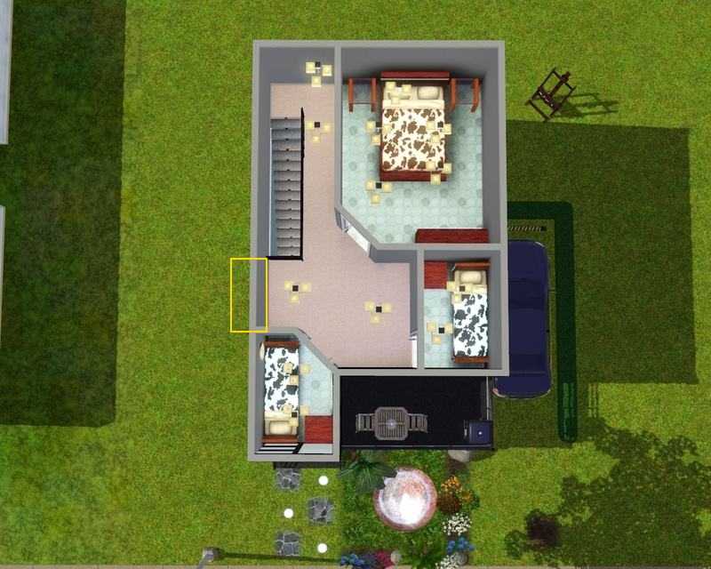
Floorplans


Advertisement
#2
20th Dec 2010 at 3:05 AM
20th Dec 2010 at 3:05 AM
Since the house has a very modern, boxy look I would make the fountain have a square pool. Then, eliminate the flowers and stick to leafy green plants. Maybe even toss in a small palm tree or two. Then to add some flair, I would line the fountain area with stones in a circular shape. Although, to be honest, for such a small simple lot, I don't see the point of adding a fountain.
I would move the tree elsewhere because it's blocking the driveway. Also, there should be some sort of patio out back where the easel is.
As far as the interior, the split level on the first floor is very cute I would suggest not using as many ceiling lights, generally one ceiling light per room will suffice. Instead try wall sconces and lamps.
"Holy Shift! Check out the asymptotes on that mother function!"
I would move the tree elsewhere because it's blocking the driveway. Also, there should be some sort of patio out back where the easel is.
As far as the interior, the split level on the first floor is very cute
I would suggest not using as many ceiling lights, generally one ceiling light per room will suffice. Instead try wall sconces and lamps.
"Holy Shift! Check out the asymptotes on that mother function!"
#3
20th Dec 2010 at 3:03 AM
20th Dec 2010 at 3:03 AM
Posts: 3,336
Thanks: 11302 in 38 Posts
Someone other than me who uses tomb lights! High five! :D
I can see the problems you're having with the front yard though. There are several things you can do with the front yard instead, so maybe I can inspire you?
I think the biggest problem with the fountain is that the geyser of water is so tall and big, and the lot is so small. Also, I've never seen a pond like that surrounded in grass. In real life, the grass and dirt would fall in the water and make it filthy. So a rock/paving terrain around couldn't hurt. Also, paving or stones on the driveway could also help give the front lawn more decoration. As for the pool. I think the foilage around the pond is too diverse. None of it fits into one specific climate type of plants, making it look busy and confusing. Maybe something simpler for such a modern house that stresses clean lines and simplicity?
Overall, it's a really cure house, and I can't wait to see what you do!
Nintendork Island | Please call me WWW!| Despite what avatar says, loves all of mts <3
#4
20th Dec 2010 at 3:11 AM
Last edited by gabrielorie : 20th Dec 2010 at 3:22 AM.
20th Dec 2010 at 3:11 AM
Last edited by gabrielorie : 20th Dec 2010 at 3:22 AM.
Hi,thanks for the reply I added the fountain because i never used it and thought it would be cool to put one in,just to try it,plus there was room for it.I'll change it around,thanks.
Thanks,this is the very first time i'm using a split level (Thanks QBUILDERZ ) and i'm still shocked it came out so nice.As for the ceiling lights i would never use that much,i just put them to make the house brighter,just for a while.But i'll add some scones,thanks!
EDIT: I didn't see your post whitewaterwood :o
I don't use these much lights xD i just got a bit excited and plopped them down everywhere
I never noticed how big it is,it is really an eyesore I was aiming to keep the yard well kept and clean looking but i'll pave by the car I was confused so i put the most attractive flowers and put them around it,making them rather unnactractive...I may have been overdoing it with the flowers,mabye the green ones that daluved suggested will look better.And thanks,i can't wait to see how it comes out either
I added the fountain because i never used it and thought it would be cool to put one in,just to try it,plus there was room for it.I'll change it around,thanks.Thanks,this is the very first time i'm using a split level (Thanks QBUILDERZ
EDIT: I didn't see your post whitewaterwood :o
I don't use these much lights xD i just got a bit excited and plopped them down everywhere

I never noticed how big it is,it is really an eyesore
I was aiming to keep the yard well kept and clean looking but i'll pave by the car I was confused so i put the most attractive flowers and put them around it,making them rather unnactractive...I may have been overdoing it with the flowers,mabye the green ones that daluved suggested will look better.And thanks,i can't wait to see how it comes out either
#5
20th Dec 2010 at 4:01 AM
20th Dec 2010 at 4:01 AM
I'm back with some pics
@daluved1 did the square fountain as you suggested but then i noticed a concave or something lke that fountain and tried it and it looks really neat,i'm going to add in the plants just now,i'm just showing these pics of what i did so far
Square Fountain

Concave Fountain

And the palm

@whitewaterwood I paved the car area,it does add to the overall atmosphere ^^ I just did that part alone,when i did the whole part it looks really,not so good...
Top view

@daluved1 did the square fountain as you suggested but then i noticed a concave or something lke that fountain and tried it and it looks really neat,i'm going to add in the plants just now,i'm just showing these pics of what i did so far
Square Fountain
Concave Fountain
And the palm
@whitewaterwood I paved the car area,it does add to the overall atmosphere ^^ I just did that part alone,when i did the whole part it looks really,not so good...
Top view
#6
20th Dec 2010 at 4:03 AM
20th Dec 2010 at 4:03 AM
Posts: 3,336
Thanks: 11302 in 38 Posts
Wow! LOVE that concave pool! That's really creative!
Nintendork Island | Please call me WWW!| Despite what avatar says, loves all of mts <3
#7
20th Dec 2010 at 4:08 AM
20th Dec 2010 at 4:08 AM
Thank you  I even shocked myself But now i'm having problems on where to put the ferns,there is no more room =/
 I even shocked myself But now i'm having problems on where to put the ferns,there is no more room =/
#8
20th Dec 2010 at 4:11 AM
20th Dec 2010 at 4:11 AM
I am really liking this house! The colours are complimenting each other great!
The interior, however. One thing, the bedrooms. I really dislike those two small bedrooms, and can Sims even use them properly? Way too many ceiling lights, as well. Also, the bedrooms calsh. A lot. Maybe try using some similar colours? I like the blue you've used for the carpet. Maybe make the wood on the bed, endtables, and dresser a brown, add a rug, maybe a bookcase?
The front yard could really use some more variety in terrain painting.
#9
20th Dec 2010 at 4:25 AM
20th Dec 2010 at 4:25 AM
Hi The bedrooms are fully functional,sims use them with complaining or anything,there's even a beautifully decorated moodlet in each of em As for the ceiling lights,they aren't staying,i just got excited and placed them crazzily xD.The bedrooms aren't done,i already have the colours i'm going to use in a house i made yesterday.As for the carpet,do you mean the ones in the bedroom?I just needed something to put the furniture on and these were the first flooring to come up but i can still use the colour,not the pattern for one of the bedrooms.And i'll paint it brown,a darkish brown.
I tried different paints but they didn't look too promising,mabye the purply violets will look good?
I'm going to try this,i'll be back with some pics in about 3 minutes.
The bedrooms are fully functional,sims use them with complaining or anything,there's even a beautifully decorated moodlet in each of em As for the ceiling lights,they aren't staying,i just got excited and placed them crazzily xD.The bedrooms aren't done,i already have the colours i'm going to use in a house i made yesterday.As for the carpet,do you mean the ones in the bedroom?I just needed something to put the furniture on and these were the first flooring to come up but i can still use the colour,not the pattern for one of the bedrooms.And i'll paint it brown,a darkish brown.I tried different paints but they didn't look too promising,mabye the purply violets will look good?
I'm going to try this,i'll be back with some pics in about 3 minutes.
#10
20th Dec 2010 at 5:22 AM
20th Dec 2010 at 5:22 AM
I think the front's done,it looks a lot better dosen't it?Also i know the fountain is big but the small one is really small and multiple ones are a bit too busy...Hope you like it too


#11
20th Dec 2010 at 5:56 AM
20th Dec 2010 at 5:56 AM
I think if you do the concave fountain, which you really should, that you should bring the driveway all the way to the street. It looks a little odd right now with the driveway just ending, and also the bamboo trees would be in the way of the car driving to the parking space, (if you're thinking realistic). Otherwise, this house is completely gorgeous.
#12
20th Dec 2010 at 6:49 AM
20th Dec 2010 at 6:49 AM
The fountain is really cute, I like it
I agree with Traelia on connecting the driveway to the road, it looks very unrealistic the way it is now.
I also have one suggestion. The left side of the house looks very flat and the brick is kinda repeating, so you could add an extension to that side.
I copied few of your pics and drew my idea for the extension there. Basicly what I would do, is add a 1x2 extra space on the side of the house, to all floors.
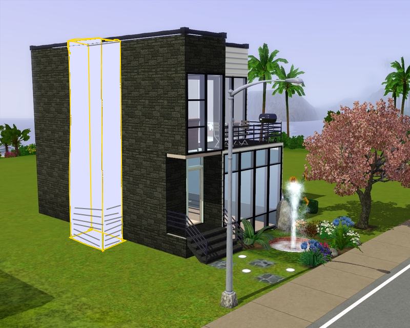
You can make it fake (not usable space) or usable, it's your choise. For wallpaints, i'd say use that wood one you have on the other side of the house (just to the extensive part!)
I'm not too good at drawing images in perspective, but i hope you get the idea. I also was lazy coloring it, and gave out on the bottom when making it look like that wooden wall
EDIT
Of course this doesn't work if you have once again built right to the edge of the lot. If that is the case, I strongly suggest on moving the house to a bigger lot, gives you more room to landscape
I agree with Traelia on connecting the driveway to the road, it looks very unrealistic the way it is now.
I also have one suggestion. The left side of the house looks very flat and the brick is kinda repeating, so you could add an extension to that side.
I copied few of your pics and drew my idea for the extension there. Basicly what I would do, is add a 1x2 extra space on the side of the house, to all floors.
You can make it fake (not usable space) or usable, it's your choise. For wallpaints, i'd say use that wood one you have on the other side of the house (just to the extensive part!)
I'm not too good at drawing images in perspective, but i hope you get the idea. I also was lazy coloring it, and gave out on the bottom when making it look like that wooden wall
EDIT
Of course this doesn't work if you have once again built right to the edge of the lot. If that is the case, I strongly suggest on moving the house to a bigger lot, gives you more room to landscape
#13
20th Dec 2010 at 2:47 PM
20th Dec 2010 at 2:47 PM
@traelia I tried that before and it looked a bit odd but i'll post some pics of it I was going for reasisticness,even though i'm not a fan of it but i'll move the bamboo to the very edge with the moveobjects cheat,that way it'll look realistic with the slate stones.
@armiel the house is on the very edge of the lot I'll move it to a bigger lot,just to try it out but I was trying to make a series of compact homes (10x10,15x10) and i was trying to make it as small and as livable as possable.Is there some sort of lot adjuster for the sims 3 in which i can put it on a bigger lot,add the extension and then make it smaller?Because I honestly like this idea,very neat Btw how did you draw it?It came out pretty nice.
I'll be back in 3-4 minutes with some piccies
I was going for reasisticness,even though i'm not a fan of it but i'll move the bamboo to the very edge with the moveobjects cheat,that way it'll look realistic with the slate stones.@armiel the house is on the very edge of the lot
 I'll move it to a bigger lot,just to try it out but I was trying to make a series of compact homes (10x10,15x10) and i was trying to make it as small and as livable as possable.Is there some sort of lot adjuster for the sims 3 in which i can put it on a bigger lot,add the extension and then make it smaller?Because I honestly like this idea,very neat Btw how did you draw it?It came out pretty nice.
I'll be back in 3-4 minutes with some piccies
#14
20th Dec 2010 at 3:07 PM
20th Dec 2010 at 3:07 PM
Posts: 7,900
Thanks: 204740 in 302 Posts
Overall I like the design of the house. But I think you have too many bedrooms for this house. You have beds for 4 sims, but have a single table with 2 chairs and a sofa with seating for 3. And just one bathroom. You have no dining inside so the sims will eat at the sofa or trek all the way upstairs to the patio to eat. Try making the living area one-two tiles smaller giving you room in the kitchen for a table and chairs. Remove the one bedroom at the front of the house upstairs and use that area for the bookcase, maybe a desk, the stereo and some reading chairs. I also think it would look better if you rotated the furniture in the living area 90°, so that the tv is against the solid wall.
Life Stories || EA Sims 2 Store Items || EA Pre-Order Incentives || Pet Stories || Dog Agility Items || Castaway Stories || Holy Simoly Add-ons || Overrides and Defaults
4esf Archive || Holy Simoly Archive || Sims2Artists || tumblr || CEP-Extras List || Buyable Game Ojbects
If you enjoy the content on s2a or GoS, consider donating to support hosting costs.
#15
20th Dec 2010 at 3:39 PM
20th Dec 2010 at 3:39 PM
The bedrooms are just spare bedrooms,for if you want to invite your sims' friends and have to space for them.When i decorate them you'll change your mind  I never really thought about a dining area,i just but the chairs upstairs for BBQing.I'll change it up a bit and i'll be back with some pics just now.
 I never really thought about a dining area,i just but the chairs upstairs for BBQing.I'll change it up a bit and i'll be back with some pics just now.
#16
20th Dec 2010 at 3:44 PM
20th Dec 2010 at 3:44 PM
@traelia I added some slate stones like you suggested,I just think its too big for the house but if you all like it i'll keep it

@armiel it looked better than i thoughtbut i had to make the lot bigger,one of the things i didn't want to do.I'm making an apartment version out of this house,mabye i can use it for that one instead?

@HL I made the livingroom smaller,leaving room for a dining table but its still too small,but two island counters instead fit nicely.I rotated the livingroom and it looks awesome There's much more room in it,even though its smaller.Upstairs I added a toilet in the extra space i had.
Dining table

Counters

Livingroom (I love how it looks now :lovestruc: )

Upstairs Bathroom

@armiel it looked better than i thought
@HL I made the livingroom smaller,leaving room for a dining table but its still too small,but two island counters instead fit nicely.I rotated the livingroom and it looks awesome
There's much more room in it,even though its smaller.Upstairs I added a toilet in the extra space i had.Dining table
Counters
Livingroom (I love how it looks now :lovestruc: )
Upstairs Bathroom
#17
20th Dec 2010 at 5:34 PM
20th Dec 2010 at 5:34 PM
Posts: 3,720
Thanks: 27204 in 66 Posts
I prefer the driveway all the way to the street. If you don't want it all the way there, maybe some dirt "tracks" where the tires would go. The grass would definitely not be growing if it was constantly being run over.
I love the extra space you added (that armiel suggested). It looks nice, both texture and shape wise. I agree with HL about there being too many bedrooms. The size of downstairs is nice and then, when you go up stairs, it just looks awkward. Especially that 3rd, smallest room. I would pull the second bedroom out and just get rid of the third room and change the patio door from sliding to a standard, one tile door.
And last, I feel it's very strange that the toilet rooms have glass doors. Especially the one attached to the kitchen.
Heaven Sims | Avendale Legacy
"On the internet, you can be anything you want. It's strange that so many people choose to be stupid."
"On the internet, you can be anything you want. It's strange that so many people choose to be stupid."
#18
20th Dec 2010 at 6:06 PM
20th Dec 2010 at 6:06 PM
the slate looks good, and the next thing you should do is make the green fence go all the way to the road as well.
I don't really understand this "obsession" with super tiny full built lots, but that's juts me, and i mean not to offend you by saying so.
The extensive part looks nice, and you are free to use or not use it on the house, it's your choise
I have to agree Heaven on the glassy toilet doors... I'm sure the sims would appreciate a little privacy
#19
20th Dec 2010 at 7:09 PM
20th Dec 2010 at 7:09 PM
@HS i actually think the slate stones look eally nice,after looking at it again so i'll keep it just the way it is I'll keep that space for an apartment edition of this house i'm building right now,but for this i'm trying to keep it small.When i decorate the bedrooms they'll look much better but if you all still don't like them then i'll have no other choice than to remove them.And i'll change the doors.Thanks!
@armiel i forgot about the fence,i'll fix that Its not an obsession,i'm just making a sort of series thingy with small,compact houses...After these i'm going to make huge ones,i already made a 40x40 one for it.And its not an insult,its just what i like building.As for the extended piece i am using it,for an apartment version of this house.For the doors i forgot about it,i just put the same doors all over the house  but i'll change it.Thank you!
I'll be back with moar pics just now,as for now look at what i was talking about,this house has the same size bedrooms and it looks equally nice when its decorated.

I'll keep that space for an apartment edition of this house i'm building right now,but for this i'm trying to keep it small.When i decorate the bedrooms they'll look much better but if you all still don't like them then i'll have no other choice than to remove them.And i'll change the doors.Thanks!@armiel i forgot about the fence,i'll fix that
Its not an obsession,i'm just making a sort of series thingy with small,compact houses...After these i'm going to make huge ones,i already made a 40x40 one for it.And its not an insult,its just what i like building.As for the extended piece i am using it,for an apartment version of this house.For the doors i forgot about it,i just put the same doors all over the house  but i'll change it.Thank you!
I'll be back with moar pics just now,as for now look at what i was talking about,this house has the same size bedrooms and it looks equally nice when its decorated.
#20
20th Dec 2010 at 8:16 PM
20th Dec 2010 at 8:16 PM
Well i updated it with an extended fence,a dorky door,one tile patio door,windows,an indoor fountain and I finished the interior,thanks for your help,it looks great so far


#21
20th Dec 2010 at 8:57 PM
20th Dec 2010 at 8:57 PM
Seems to me that you took left out the dining again. At one point you had counters and stools, but now there is a fountain, which is cute, but the sims really need a place to eat, if you want the house to be realistic. Right now they'll use either the toilet seat, or the table at second floor balcony for eating, and that's not really handy...
I like the colours and patterns on the livingroom. The kitchen looks a bit bright, maybe you could either choose darker wall material, or tone the light down a little on it's debug menu.
I like the colours and patterns on the livingroom. The kitchen looks a bit bright, maybe you could either choose darker wall material, or tone the light down a little on it's debug menu.
#22
20th Dec 2010 at 9:05 PM
20th Dec 2010 at 9:05 PM
Crud,i forgot the counters.That's ok,there's room for them by the 2 tile window by the kitchen.For the kitchen i had windows there,the ventana alma or something like that (The 3 tiled one) but i removed it because i know that there may be some conflicts about the counters showing outside but i'll make it a bit darker,mabye put a stone pattern instead...I'll experiment a bit.Btw does anyone know how to make the area by the split level bright?I put a light and it dosent work and i put the big debug light and it lit up the entire yard but that area was still dark
#23
20th Dec 2010 at 10:35 PM
20th Dec 2010 at 10:35 PM
Place a floor light there to illuminate the lounge area; since it is technically on a different storey to the kitchen wall or ceiling lights will not work.
I will choose a path that's clear- I will choose free will
-RUSH- -RADIO- -RADIO- -EON- -ARCHIVES-
Simpeople and Me Archive- 11Dots Archive- My Sims World Archive- Sims 1 Archive
Angel Classic Rock Mix!
-RUSH- -RADIO- -RADIO- -EON- -ARCHIVES-
Simpeople and Me Archive- 11Dots Archive- My Sims World Archive- Sims 1 Archive
Angel Classic Rock Mix!
#24
20th Dec 2010 at 11:51 PM
20th Dec 2010 at 11:51 PM
Hmmm this is looking quite nice, but make sure you play test some of the smaller areas because there might be some routing issues. Especially that upstairs bedroom with the diagonal wall. Just make sure that sims can easily get into all the beds, and use all of the important objects.
#25
21st Dec 2010 at 1:42 AM
21st Dec 2010 at 1:42 AM
@simsample I already have four lights there,but they only work in the night
@traelia i playtested it and it works fine,no issues or anything but if you guys really don't like it after its decorated and such i'll remove one of them and but a statue or something instead
I have one question though...I was tinkering with the outdoor walls and put some sliding by the patio area right down to the ground,does it look nice ot should i just keep it the way it was?

I'm almost done with the interior,just adding a few more details
@traelia i playtested it and it works fine,no issues or anything but if you guys really don't like it after its decorated and such i'll remove one of them and but a statue or something instead
I have one question though...I was tinkering with the outdoor walls and put some sliding by the patio area right down to the ground,does it look nice ot should i just keep it the way it was?
I'm almost done with the interior,just adding a few more details

| Locked thread | Locked by: spladoum Reason: useful home-decorating info. | |
Who Posted
|
|